
VITA GROUP
CASE /54 · PAPER PACKAGING, MOSCOW
Brand book for Vita Group.
Vita Group is a paper packaging manufacturer: kraft bags with twisted and flat handles, corrugated boxes, wrapping paper. Its own production facility is in Moscow, and its customers range from cafés and shops to large companies that care about eco-friendly packaging. We had already worked with Vita Group on SEO — growing organic traffic and leads for vitagroup.ru. The next step was a task about the brand itself.
A BRAND BOOK FOR A PAPER PACKAGING MANUFACTURER: LOGO, TYPOGRAPHY, PALETTE, PHOTO CONTENT AND BRANDED COLLATERAL — ONE VISUAL LANGUAGE FROM BUSINESS CARD TO BOX.
PROJECT TEAM
 ValeriaWEB DESIGNER
 NataliaUX PROTOTYPER
 AngelinaPROJECT MANAGER
CLIENT
NICHE
CLIENT'S WEBSITE
WHAT WE DID
RESULT
Background
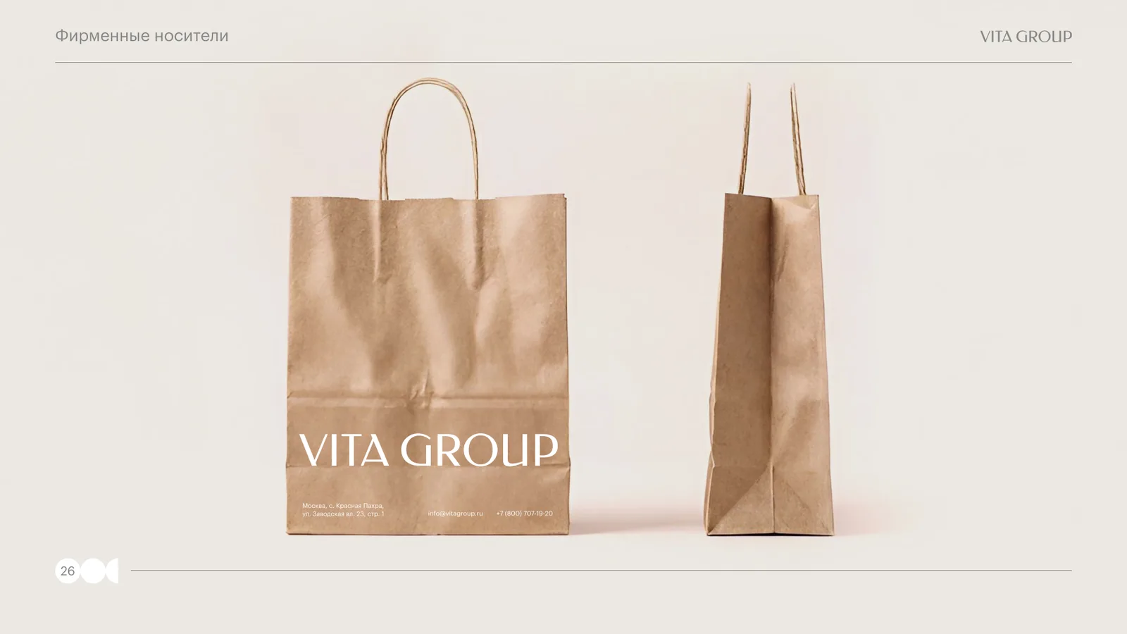
Vita Group is a paper packaging manufacturer: kraft bags with twisted and flat handles, corrugated boxes, wrapping paper. Its own production facility is in Moscow, and its customers range from cafés and shops to large companies that care about eco-friendly packaging. We had already worked with Vita Group on SEO — growing organic traffic and leads for vitagroup.ru. The next step was a task about the brand itself.
What we started with:
- a product whose quality is the main selling point: dense paper, honest kraft, natural materials;
- a visual style that did not live up to that quality — packaging, documents, e-mails and signage were designed differently every time;
- two markets: Russian (Vita Group LLC, Moscow) and international (vitagroup.ae), and the brand had to look the same on both.
The task: refresh the corporate identity and put together a guide that any contractor — a print shop, a designer, a sales manager — could use to produce a branded item correctly without the agency's involvement. Packaging matters more here than usual: as the brand book puts it, it is the customer's first physical touchpoint with the brand.
How we worked
The project took roughly a month. The team: a web designer, a prototyper and a project manager. The idea behind the style is summed up in one sentence: the brand should be as honest, natural and modern as the kraft paper its packaging is made from.
The order of work:
- analysed the product and how it is used — exactly where the customer meets the brand: a bag in their hands, a box in the warehouse, an e-mail from a manager, a sign at the gatehouse;
- fixed the logo and selected a font pairing;
- built a palette with exact codes for screen and print;
- wrote the rules for photo content;
- designed the branded collateral and brought everything together in a 34-page guide in six sections: logo, typography, colour palette, photo content, branded collateral, contacts.
Logo
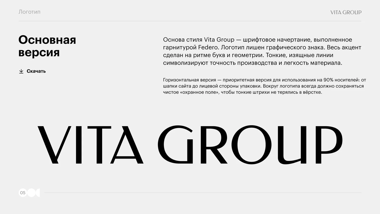
The Vita Group logo is a wordmark set in the Federo typeface, with no graphic symbol. All the emphasis is on the rhythm of the letters and their geometry: thin, elegant lines symbolise the precision of production and the lightness of the material.
The logo comes in two versions. The horizontal one is the priority, used on 90% of items: from the website header to the front of the packaging. The vertical one is for formats where the horizontal version does not fit.
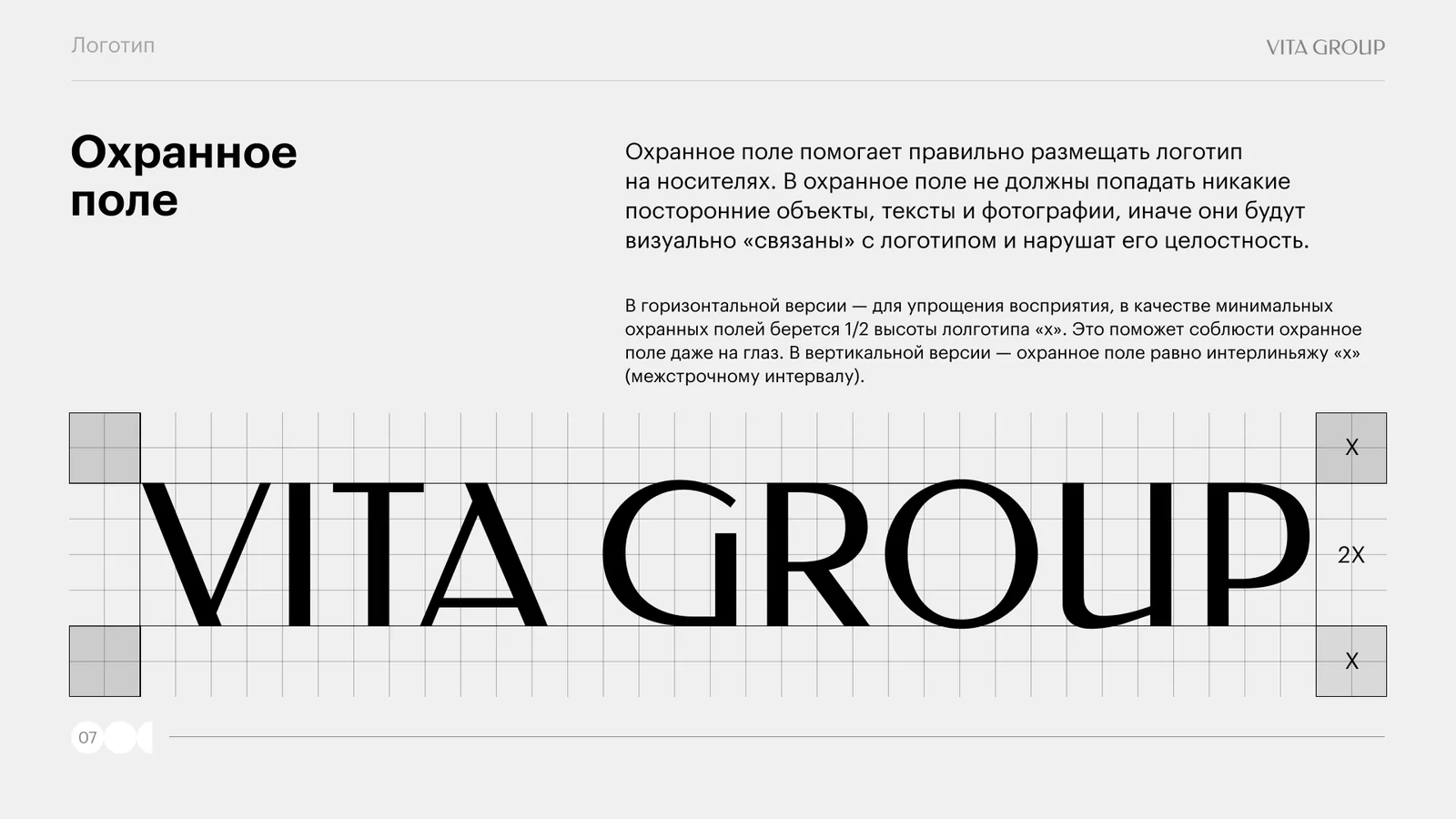
Because of its thin strokes, the logo needs clean space around it. The clear space is defined so it can be judged by eye: in the horizontal version it is half the logo's x-height, in the vertical version it is the x-height leading. No text, objects or photographs may fall inside the clear space.
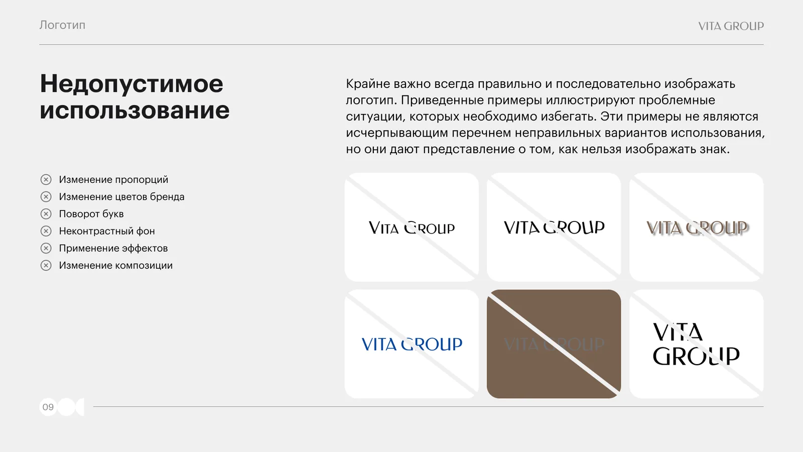
Separate spreads cover the chromatic range (black on white, white on black for print limitations), use on the brand's coloured backgrounds, and what must not be done: changing the proportions and colours, rotating the letters, adding effects, placing it on a low-contrast background, changing the composition.
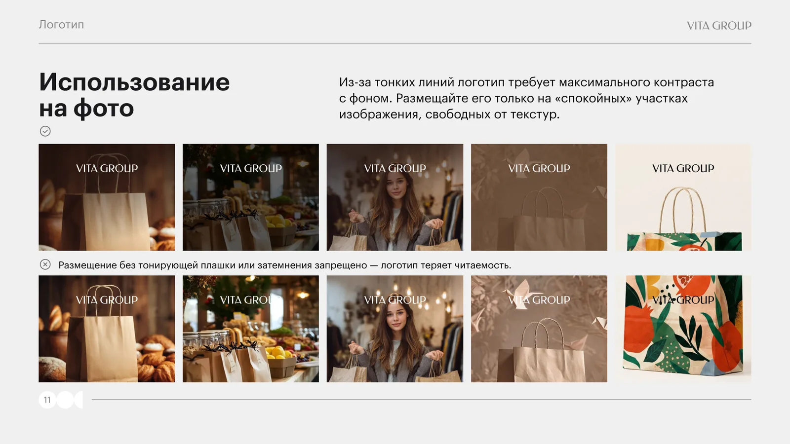
On photographs the logo is placed only on “calm” areas free of textures, and always with a tinted overlay or darkening — otherwise the thin lines lose legibility.
Typography
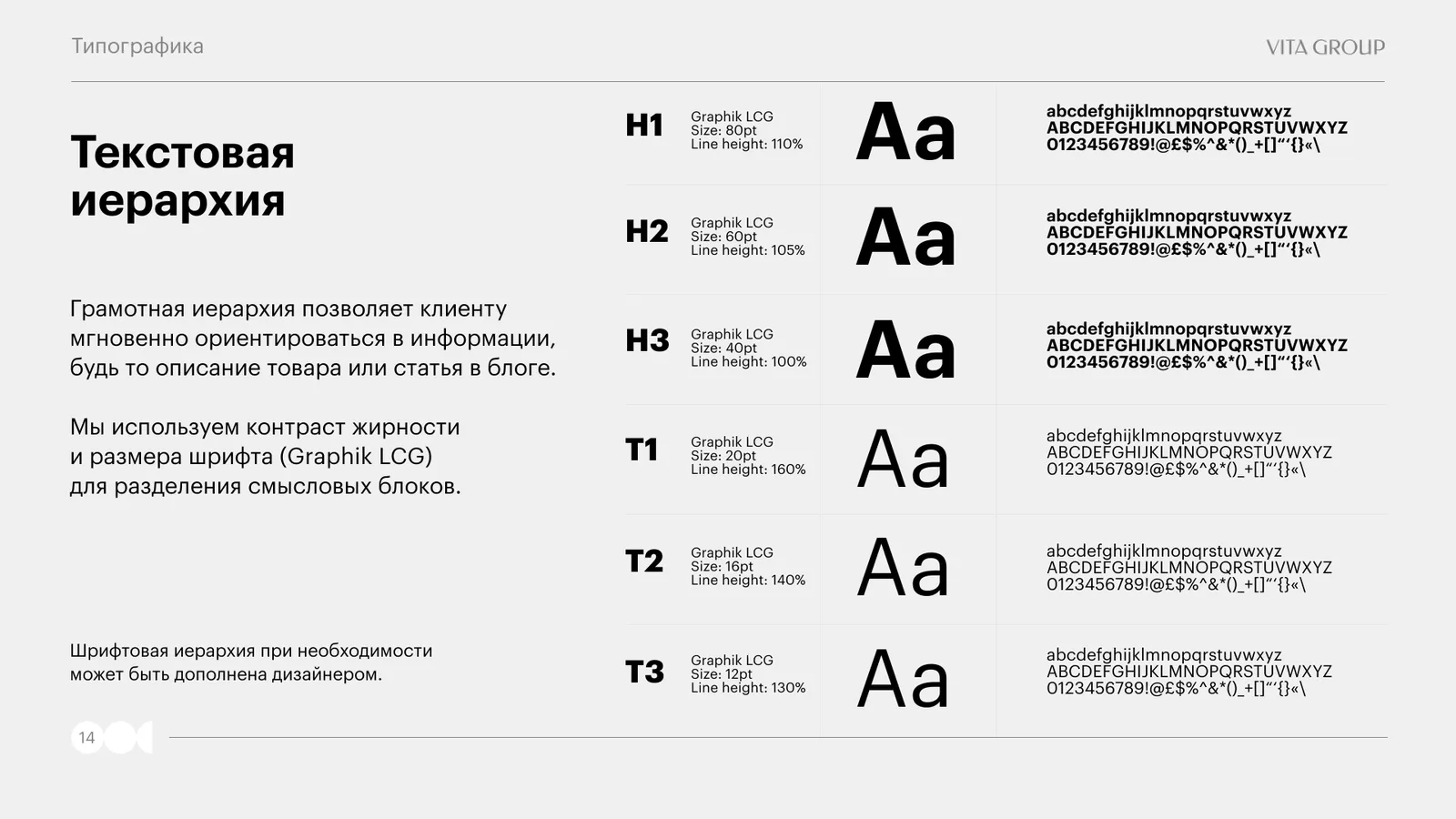
The primary typeface is the Graphik LCG family: a modern geometric grotesque with a neutral character and a wide range of weights from Regular to Bold. It does not draw attention to itself and leaves the logo as the main focus.
For cases where the brand typeface cannot be used — a letterhead, a presentation — Inter is permitted. The hierarchy is described in six styles with point size and leading: headings H1 80 pt / 110%, H2 60 pt / 105%, H3 40 pt / 100%, body text T1 20 pt / 160%, T2 16 pt / 140%, footnote T3 12 pt / 130%.
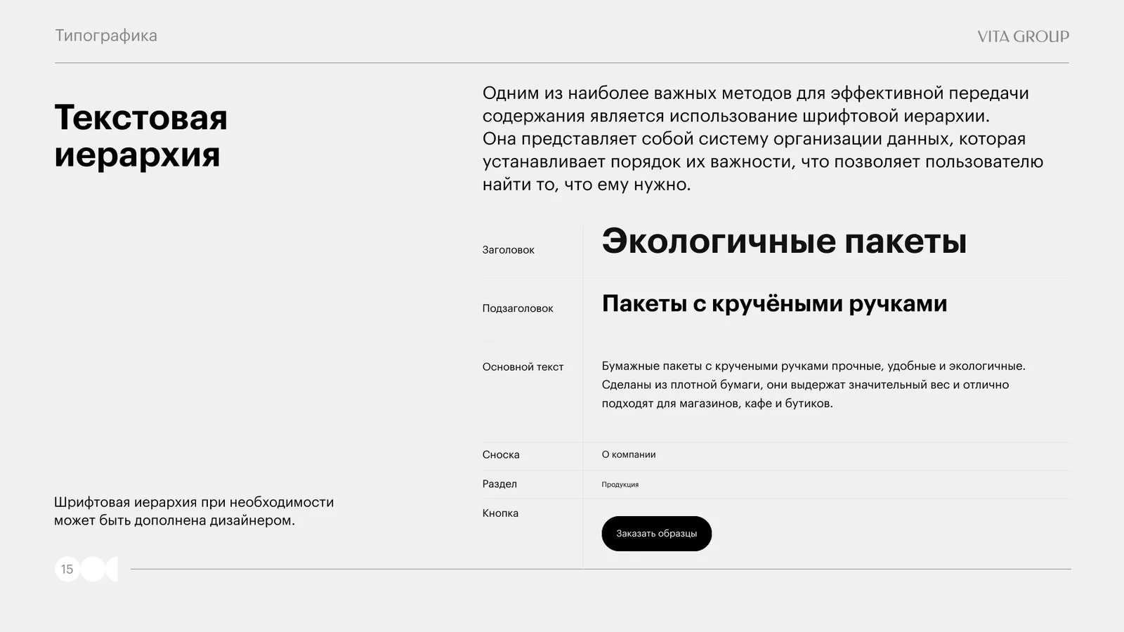
So that the rules would not remain abstract, the hierarchy is shown on a live example — the “Bags with twisted handles” product card: heading, subheading, body text, footnote, section and the “Order samples” button.
Colour palette
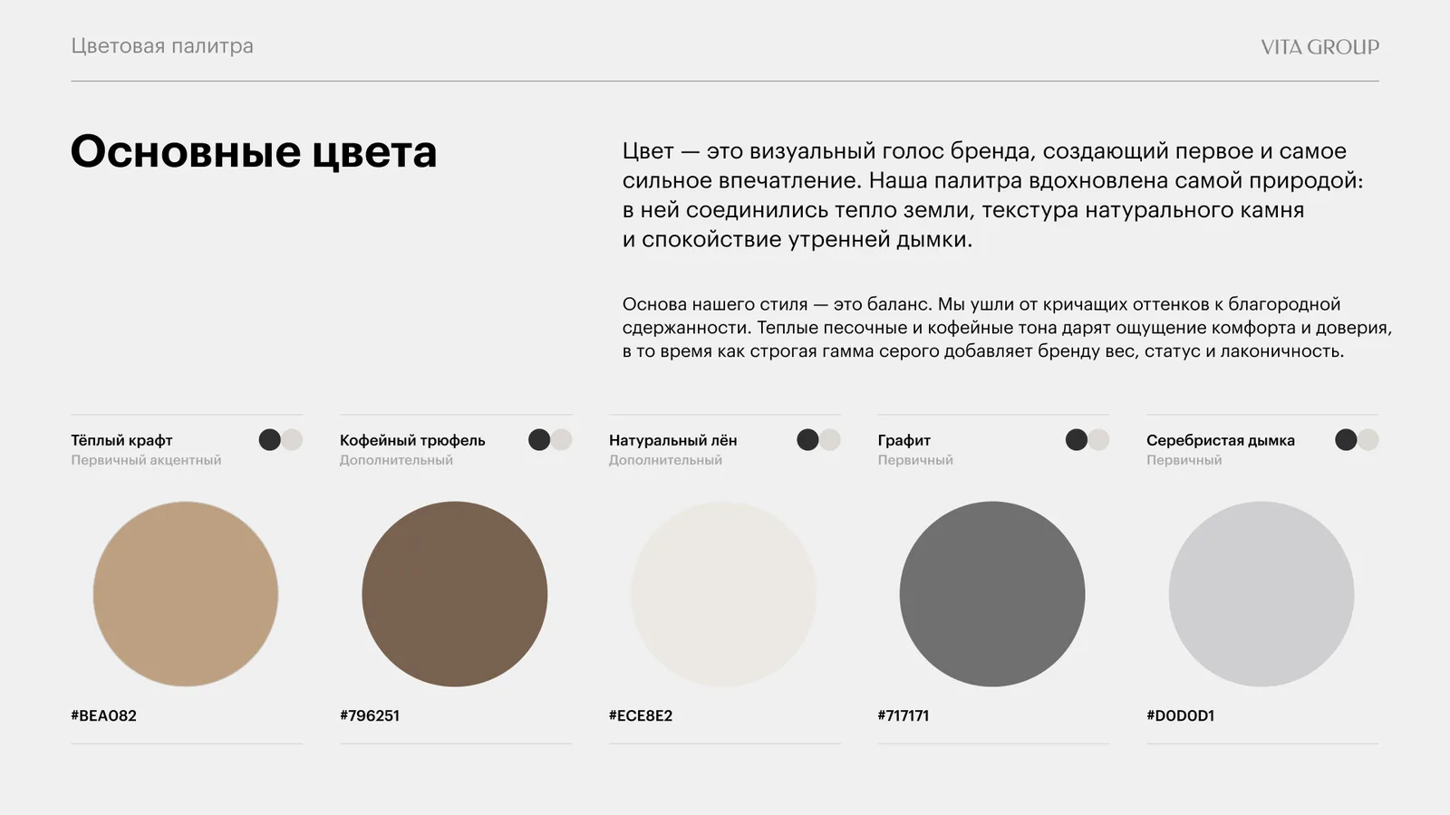
The palette is inspired by nature: the warmth of the earth, the texture of natural stone and the calm of morning haze. Five colours — warm kraft #BEA082, coffee truffle #796251, natural linen #ECE8E2, graphite #717171 and silver haze #D0D0D1.
The principle is balance instead of loud shades: warm sandy and coffee tones give a sense of comfort and trust, while the restrained grey range adds weight and restraint to the brand.
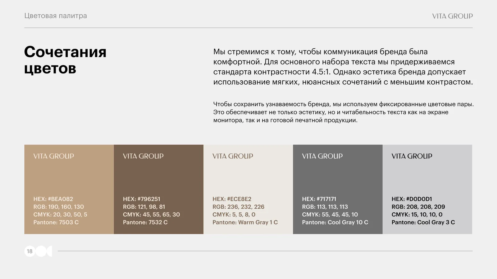
Each colour has HEX, RGB, CMYK and Pantone values — so that packaging from the print shop and the website on screen match. For body text we keep a contrast ratio of 4.5:1, while the fixed colour pairs allow soft, nuanced combinations where small text does not need to be legible.
Photo content
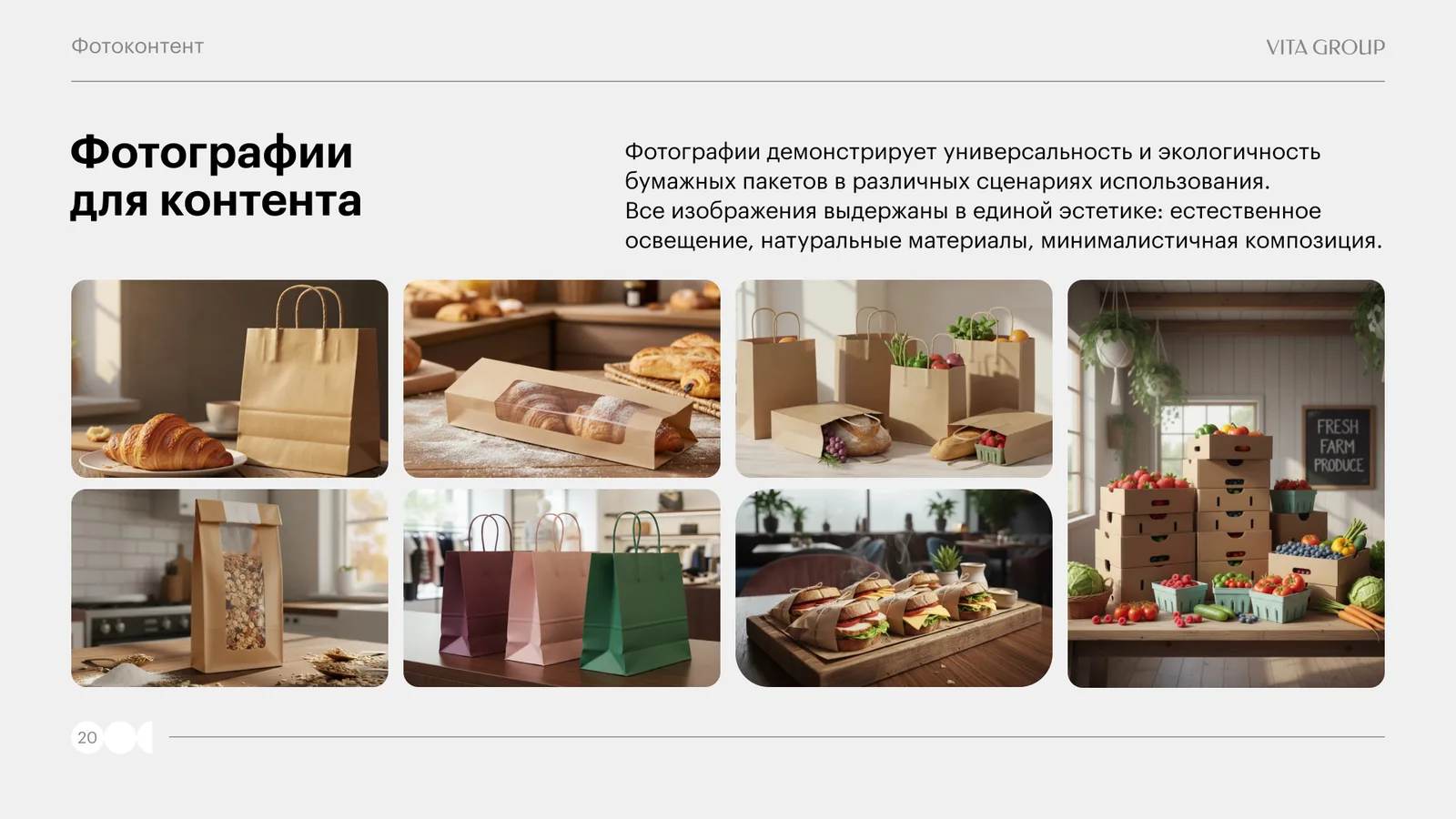
The photographs show the versatility and eco-friendliness of paper bags in real-life settings: a café, a bakery, a shop, a delivery. All images share a single aesthetic.
Four rules: natural lighting — daylight only; a neutral background — the focus is on the product, not the surroundings; a warm palette — browns, beiges, natural shades; authenticity — real usage scenarios rather than staged shots. And three prohibitions: artificial lighting, cluttered compositions, bright shades. Each rule is illustrated with a “do / don't” pair.
Branded collateral
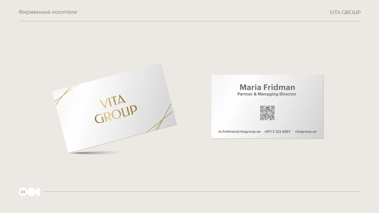
The style was tested on the items a Vita Group customer actually encounters: business cards, an e-mail signature, a kraft bag, notebooks, a box with tape, a pen, workwear and a hard hat at the plant, signage on glass and a door plate.
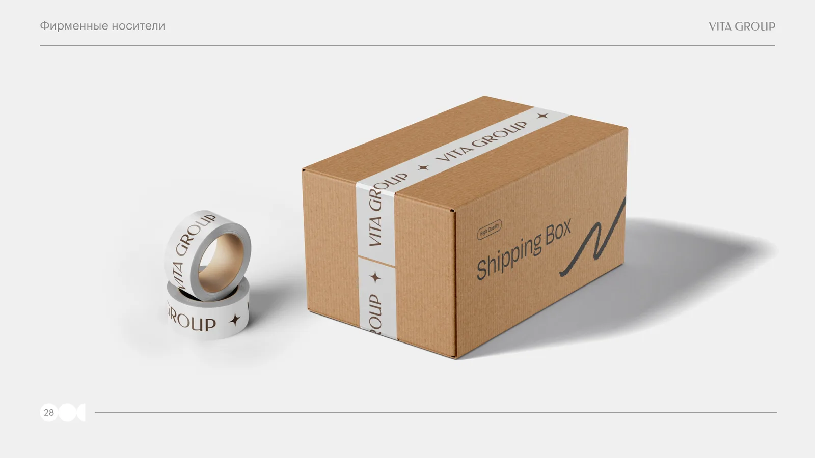
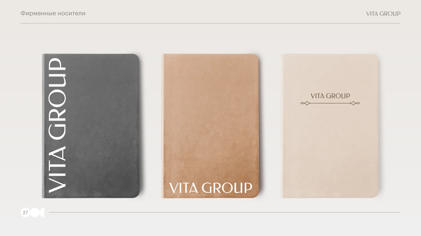
The collateral comes in two versions — for the Russian market with the details of Vita Group LLC, and for the international market with vitagroup.ae contacts. Everywhere, the logo follows the rules from the first section: high contrast, with clear space, on a calm background.
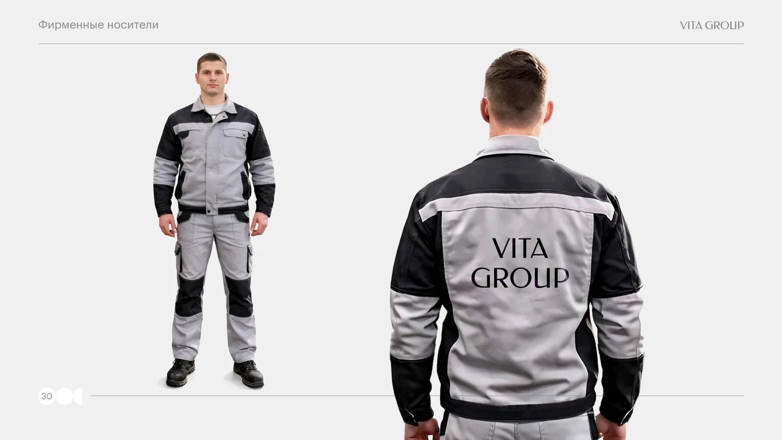
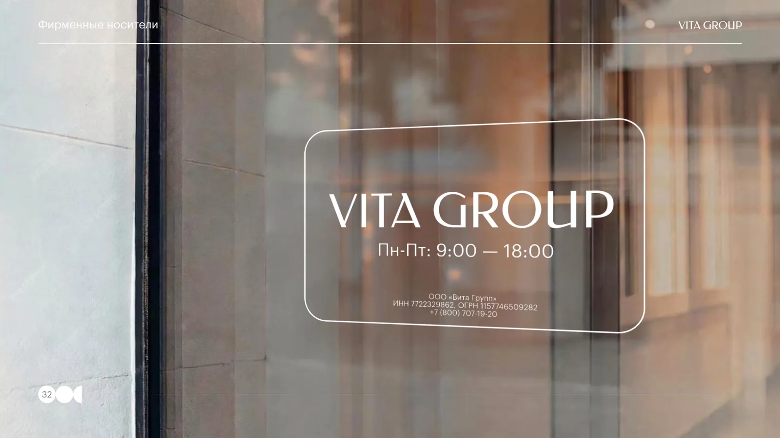
Production-site items — workwear, hard hat, the sign at the gatehouse — matter no less than business cards: they are what the drivers, buyers and partners who visit the plant see.
Result
Vita Group received a 34-page brand identity guide: the logo in two versions with rules for its use, a typographic system, a palette with print and screen codes, photo content standards and layouts for branded collateral.
The result: the brand now has a single visual language from business card to box — any contractor can produce a new item from the guide, and it will look like part of the brand.


FAQ
FAQ.
Yes, we offer full-cycle social media promotion: strategy, content creation, targeted advertising and results analytics.
We give you access to trello/asana where you can see every stage of the work. We also hold regular calls and send progress reports.
Yes, we work with staged payments. You pay for each completed stage according to the approved plan.
Timing depends on the project's complexity. On average a website takes 2 to 6 weeks. We always give exact deadlines before the work starts.
We can work with your content or offer our copywriters to create unique texts and select images.
The price is made up of the scope of work, functionality complexity, design and additional services (content, CRM integration, etc.). We provide a detailed estimate broken down by stages.
With an audit: we study the business, the audience and the goals and shape a clear strategy. Then we fix the terms in a contract, agree on the details and start. Results are shown in numbers, and we build the project's growth on them.
You can leave a request at any time — our operators will call you back within a day. The office works on weekdays from 10:00 to 19:00 moscow time.
Still have questions? We may already know the answer
WE'LL GET BACK TO YOU WITHIN ONE BUSINESS DAY

GOT A TASK?
Ready to grow?
Leave a request and our managers will get back to you within one business day