

gpk Granit
case /54 · stone products manufacturing, petrozavodsk
Landing page for “GPK Granit”.
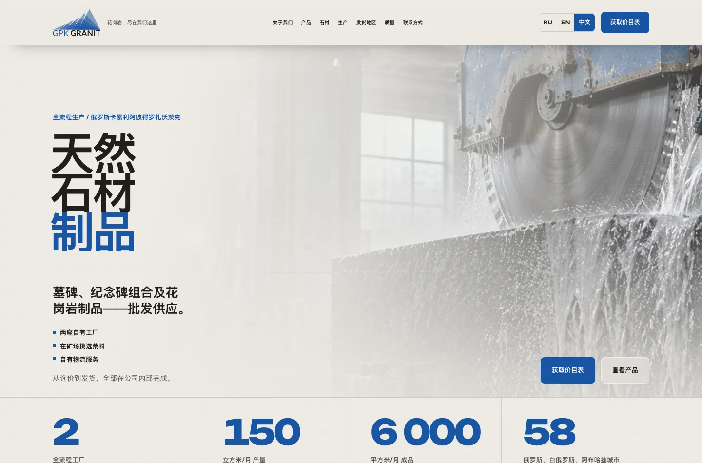
GPK “Granit” is a mining and industrial company from Petrozavodsk: two full-cycle plants of its own, natural stone products wholesale. Monuments, memorial complexes, vases, spheres and blanks - from selecting blocks at the quarry to shipping the finished batch. They came to us for a landing page that builds loyalty among the production's wholesale customers.
a real case study, from brief to result: how we work and what results we achieve
project team
 Evgenydeveloper
 Elenafront-end developer
 Nataliaux prototyper
 Kirillqa engineer
client
niche
year
client's website
what we did
result
The brief
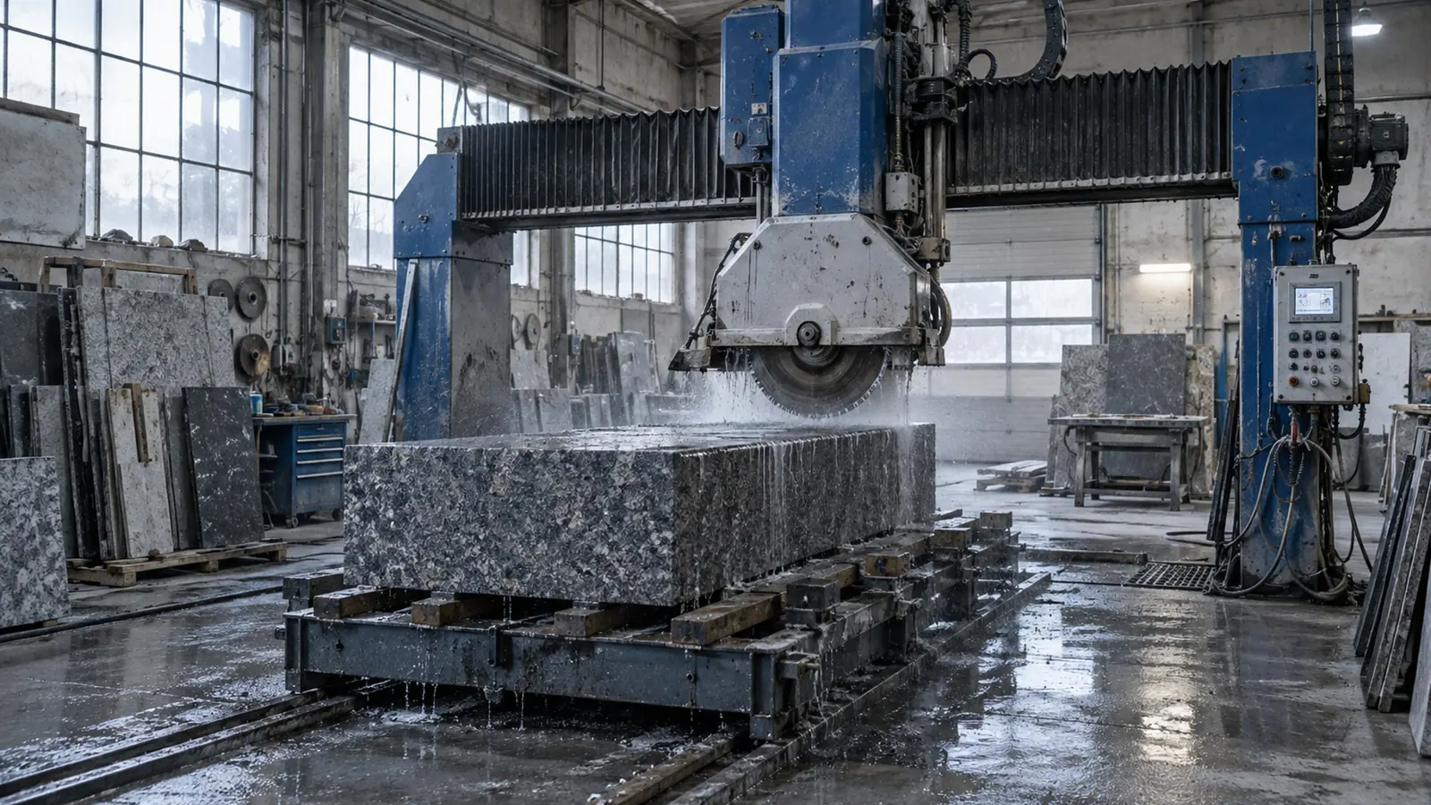
GPK “Granit” is a mining and industrial company from Petrozavodsk: two full-cycle plants of its own, natural stone products wholesale. Monuments, memorial complexes, vases, spheres and blanks - from selecting blocks at the quarry to shipping the finished batch. They came to us for a landing page that builds loyalty among the production's wholesale customers.
What we had to start with:
- an operating production: two plants in Petrozavodsk, over 150 m³ of products a month, shipments to 58 cities in Russia, Belarus and Abkhazia;
- an old website that no longer reflected the scale of the company;
- a lot of the company's own content - production photos, characteristics of stone types, quality control criteria, price-list dimensions. All of it had to be heavily reworked, adapted and redrawn.
The task wasn't lead generation - no paid traffic was sent to the landing page. The page was needed as a showcase of the production: so that a wholesale buyer or funeral parlour could see who they were dealing with and come back for the next batch.
The company works for the international market, so the project got a sequel: English and Chinese versions were added to the Russian one. Their audience is wholesale buyers abroad and Chinese stone importers.
How we worked
We built the landing page turnkey in two working days. Everything was on our side: structure, design, copy, layout and programming. The team was the same as on our other projects: project manager, account manager, designer, front-end developer, programmer.
Two days was possible because the client supplied ready facts and we didn't spend time collecting them. The main job wasn't “inventing from scratch” but bringing order: arranging the material logically, rewriting the copy in a calm business tone and redrawing the graphics in a single style.
Later the site kept absorbing the client's material: real photographs of the workshop and the quality control department appeared, stone samples were reshot, product cards were updated. The English and Chinese versions were a separate run, and it took one working day: from breaking the layout down into dictionaries to publishing on the live site.
Design: graphite, blue and large typography
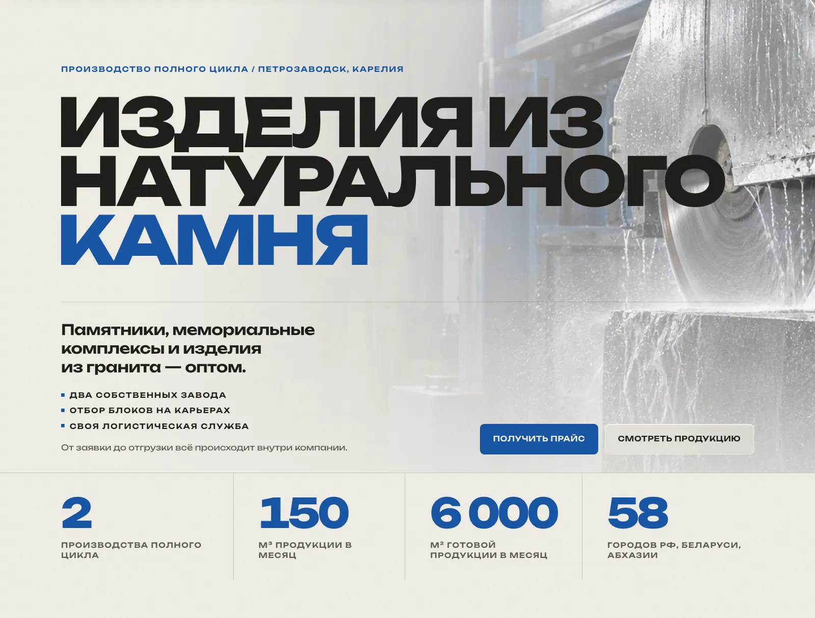
Stone production websites usually look heavy and garish. We created a strict industrial design: a light “stone” background, deep graphite sections, a blue accent and very large headings.
What the visual language is built from:
- Alternating light and dark graphite sections set the rhythm of the long page and divide it into thematic chapters.
- One accent colour - a rich blue. It's used on buttons, section numbers and thin lines, and nowhere else.
- Large display typography: the headings are set in a wide grotesque and work as on-screen navigation.
- Live counters in the company figures - two plants, 150 m³, 6,000 m², 58 cities - count up on scroll and read as proof.
- Production shots are brought to the single tonal range of black gabbro - the way the stone actually looks, and so that the frames don't clash with the graphite background.
A separate note on colour: the first version of the landing page was built in an orange palette, then, in agreement with the client, switched entirely to blue - it fits the character of stone production more precisely and is calmer to read.
Products and content
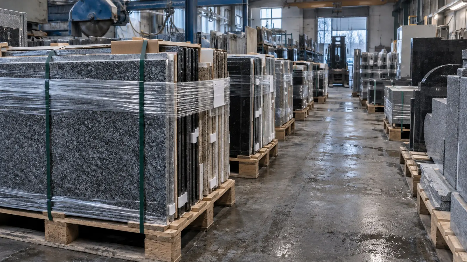
The main work was with the client's content: we gathered scattered materials into a clear structure where a wholesale buyer finds what they need within a minute.
What went into the content:
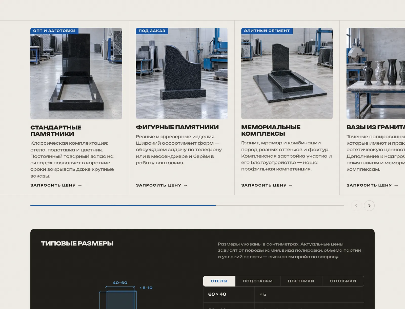
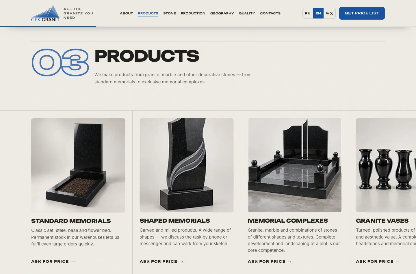
- a product catalogue in six categories - standard and shaped monuments, memorial complexes, vases, spheres, posts and blanks, each with its own description and photo;
- a block of standard sizes: the “headstone, base, flower bed, post” set with dimensions and polishing options, laid out so it can be seen without a price list;
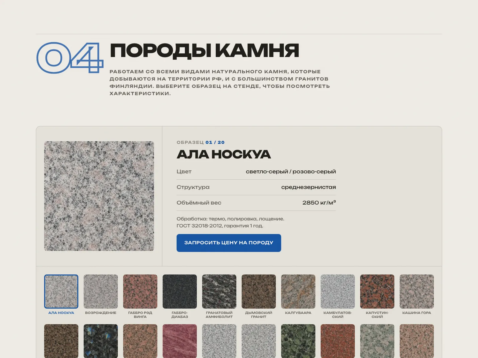
- characteristics of stone types - colour, structure, bulk density, finishing and GOST standard for each type.
The stone types were presented as an interactive catalogue: the visitor picks a sample on the display and instantly sees its characteristics. This is more convenient than a long table and shows the range better.
Production, quality and logistics
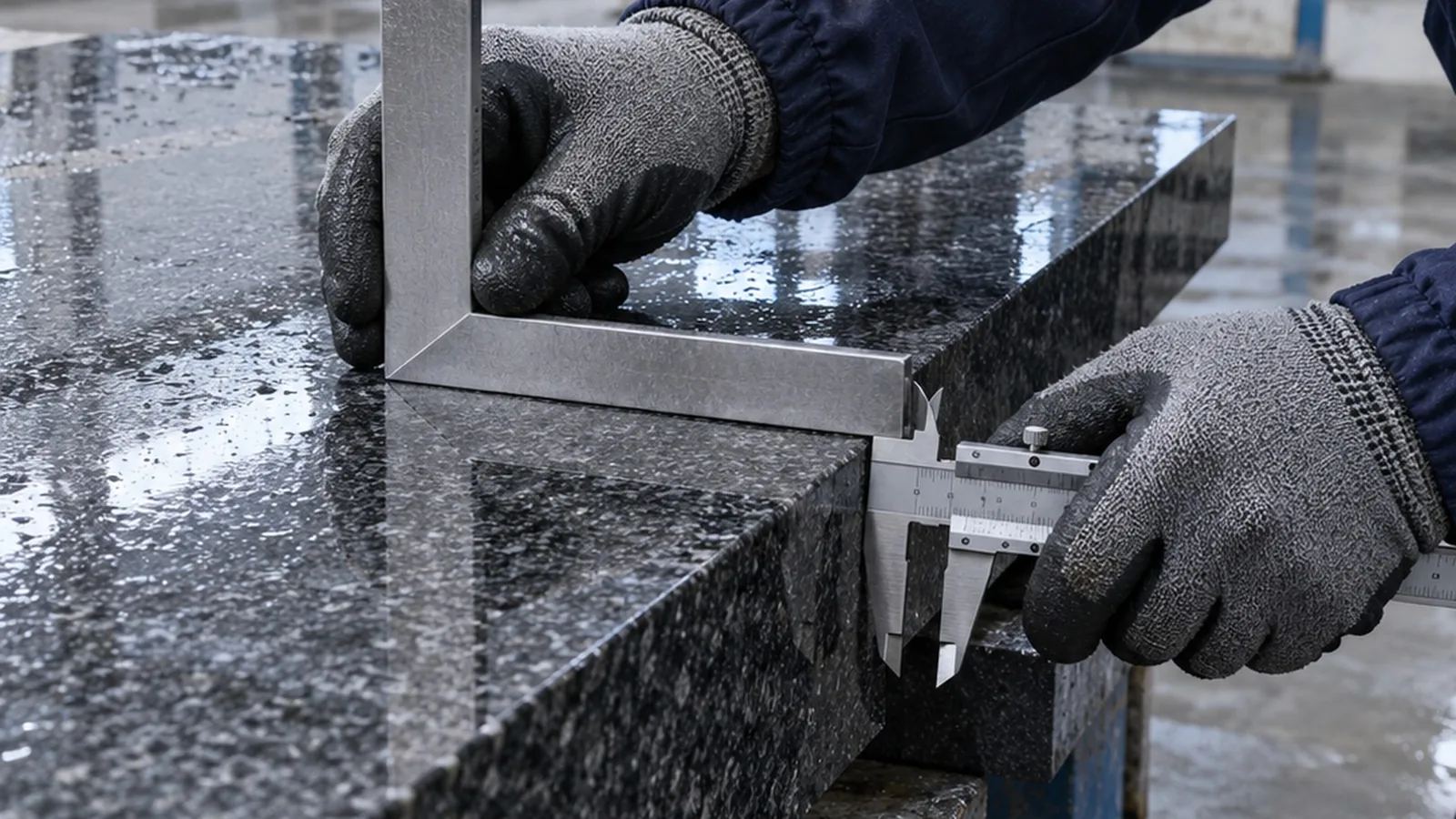
For the landing page to build trust, we showed the production from the inside - the way that matters to a wholesale customer.
- Two full-cycle plants with addresses, coordinates and links to 2GIS and Yandex Maps - for each site you can see what is made there.
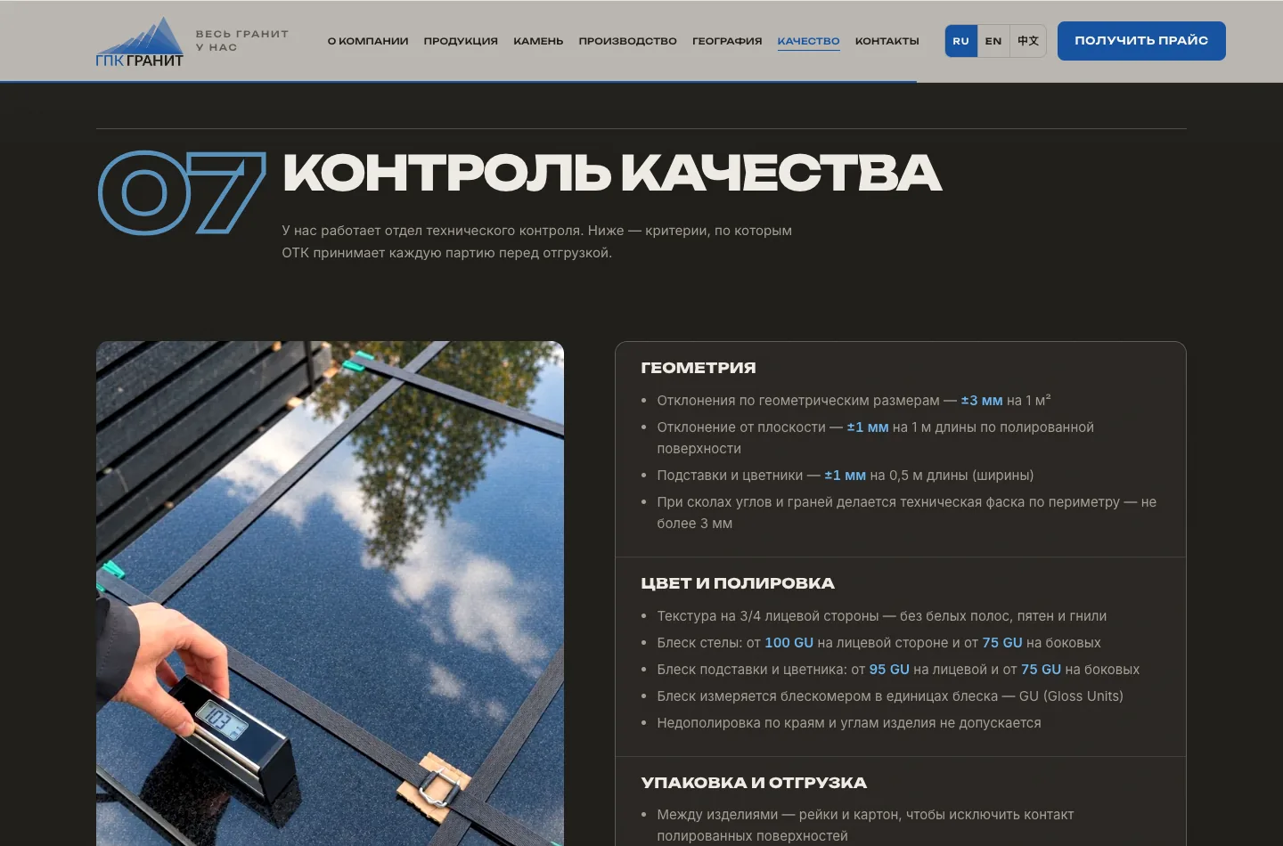
- A quality control section: the technical control department's criteria for geometry, colour, polishing and packaging - with the option to download the full criteria as a separate file.
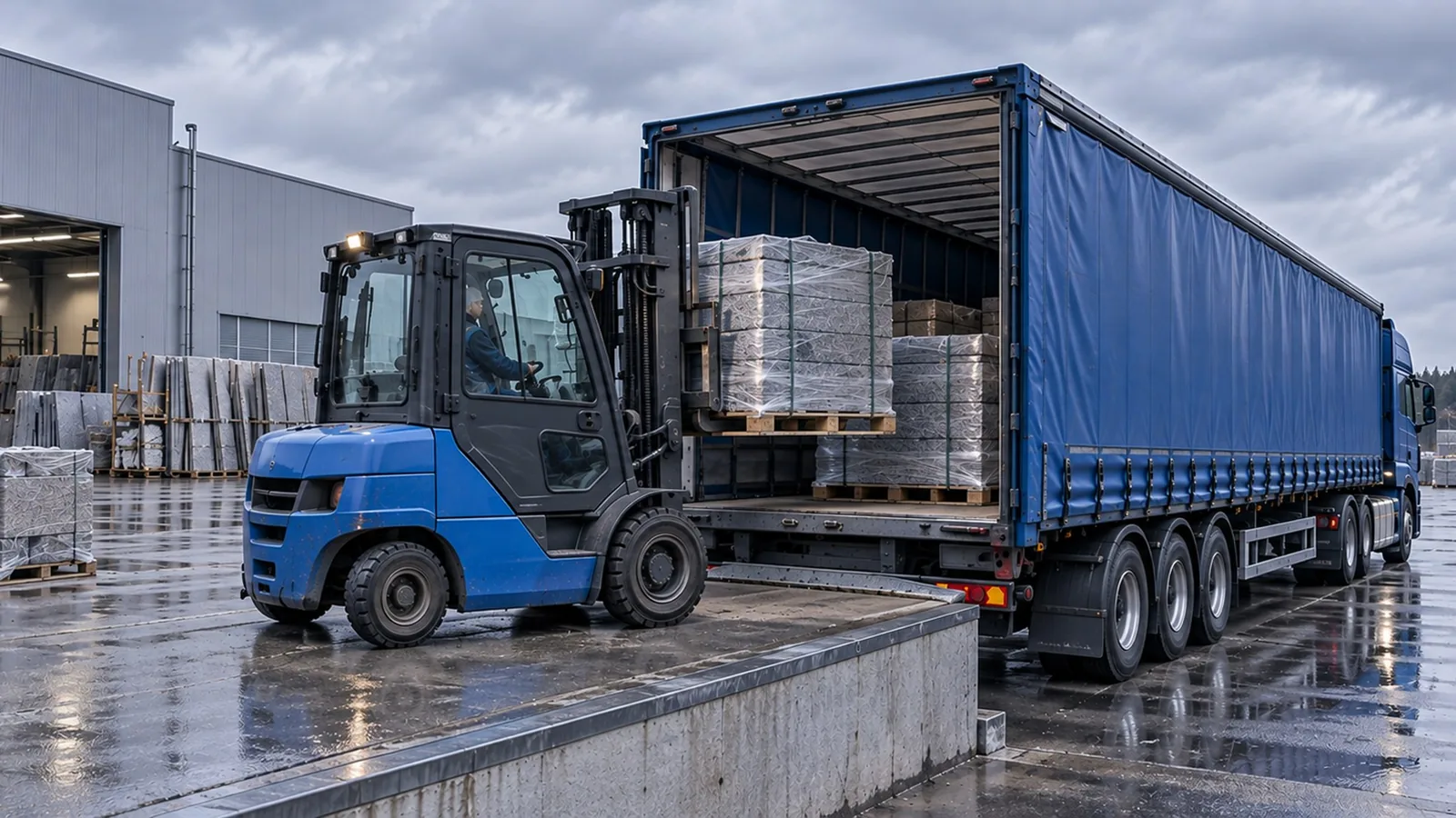
- In-house logistics with door-to-door delivery and the supply geography.
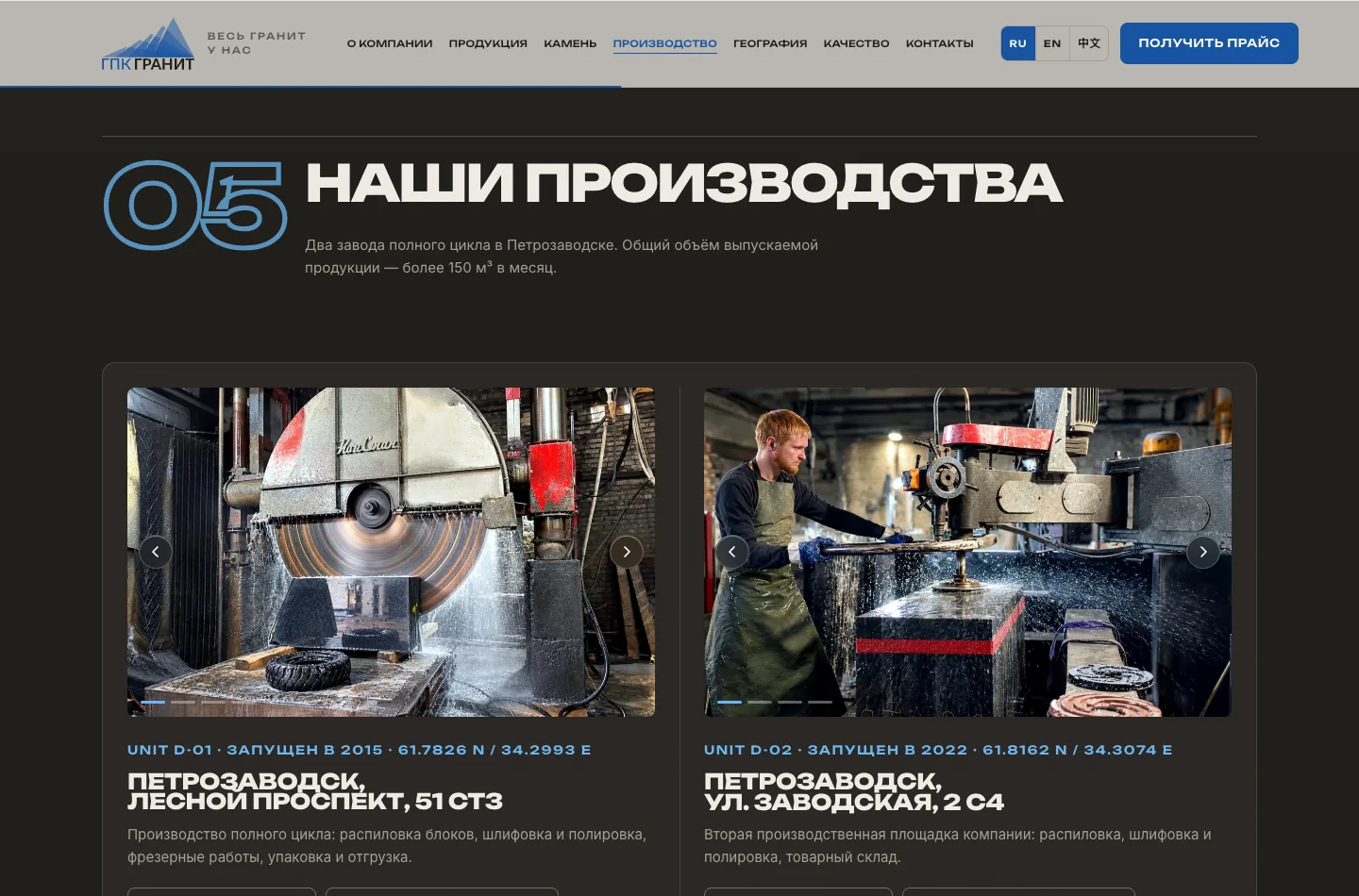
The quality control criteria are not vague words but specific tolerances: a geometry deviation of ±3 mm per 1 m², a headstone gloss from 100 GU on the face, a pallet weight of up to 2,000 kg. Figures like these close half of a wholesaler's questions before they even speak to a manager.
Development and interactivity
Under the bonnet is not an off-the-shelf builder but our own layout and scripts. There are no heavy libraries, so the page loads fast even with a large amount of content.
What was done in development:
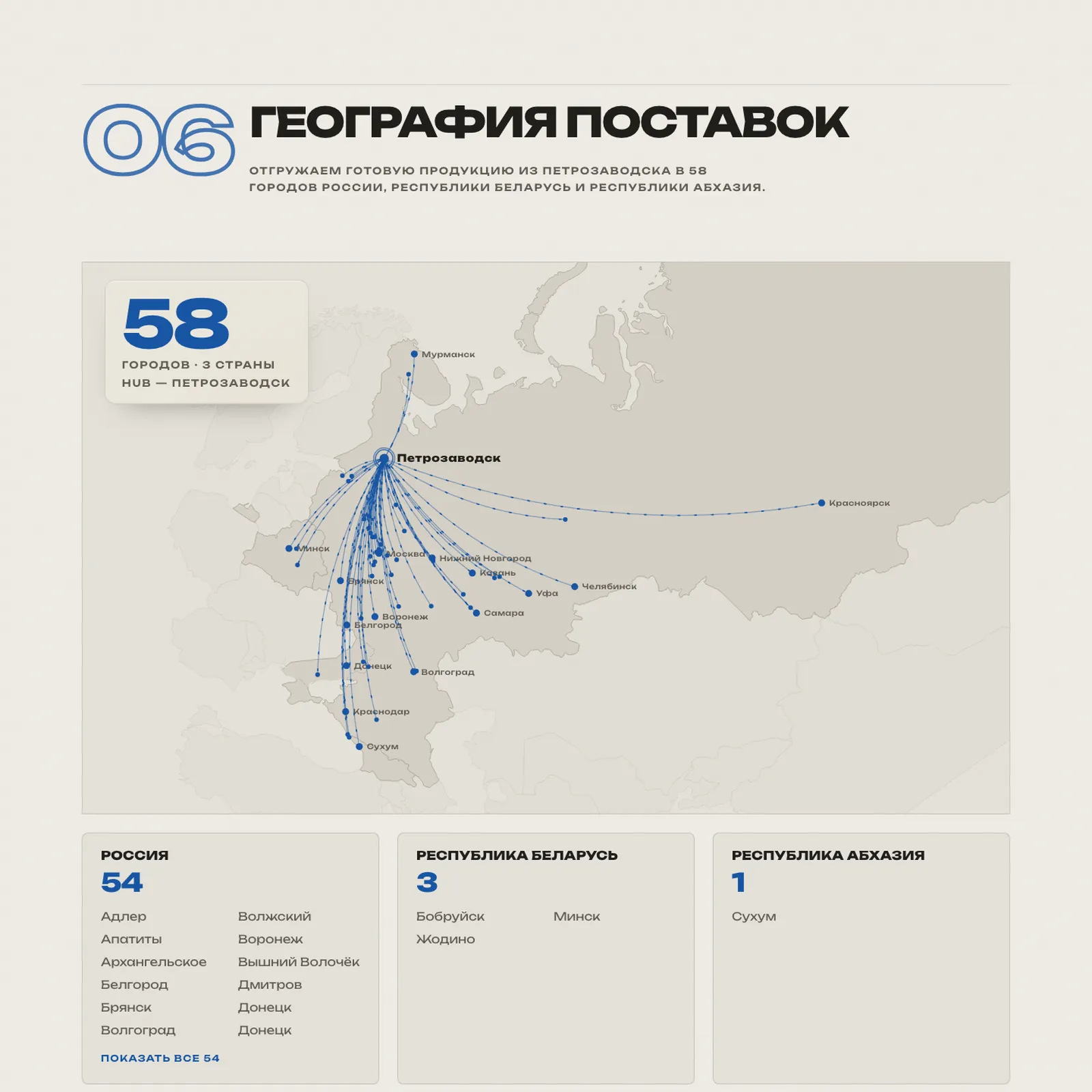
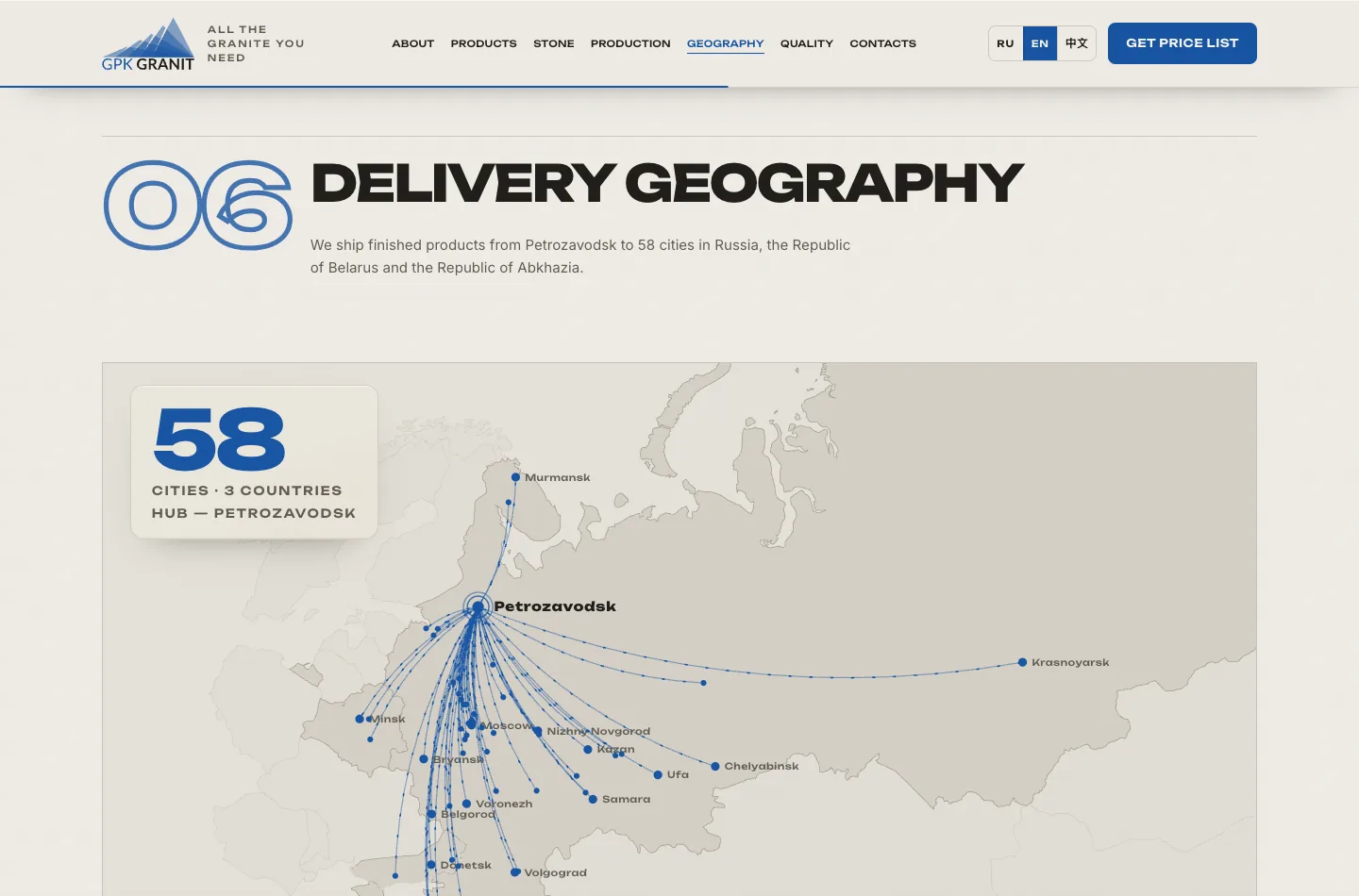
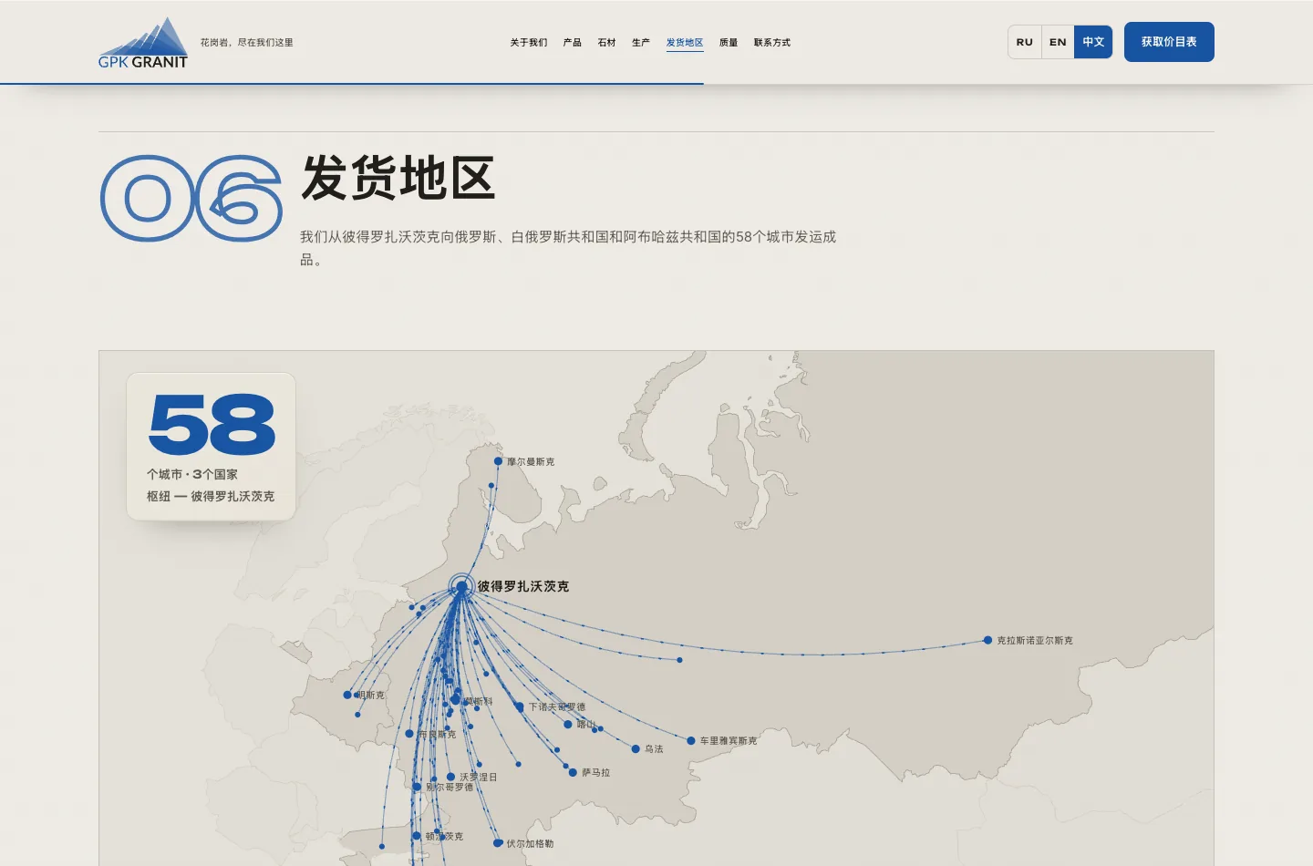
- an interactive supply geography map: routes fan out from Petrozavodsk to 58 cities in three countries;
- a switchable stone type catalogue and a product carousel on our own code;
- enquiry forms with file upload of up to 10 MB - a drawing, specification or photo is attached directly to the enquiry;
- section reveal animations on scroll, counters and a price request pop-up;
- a cookie banner for technically necessary cookies only, links to the policy and consent to data processing.
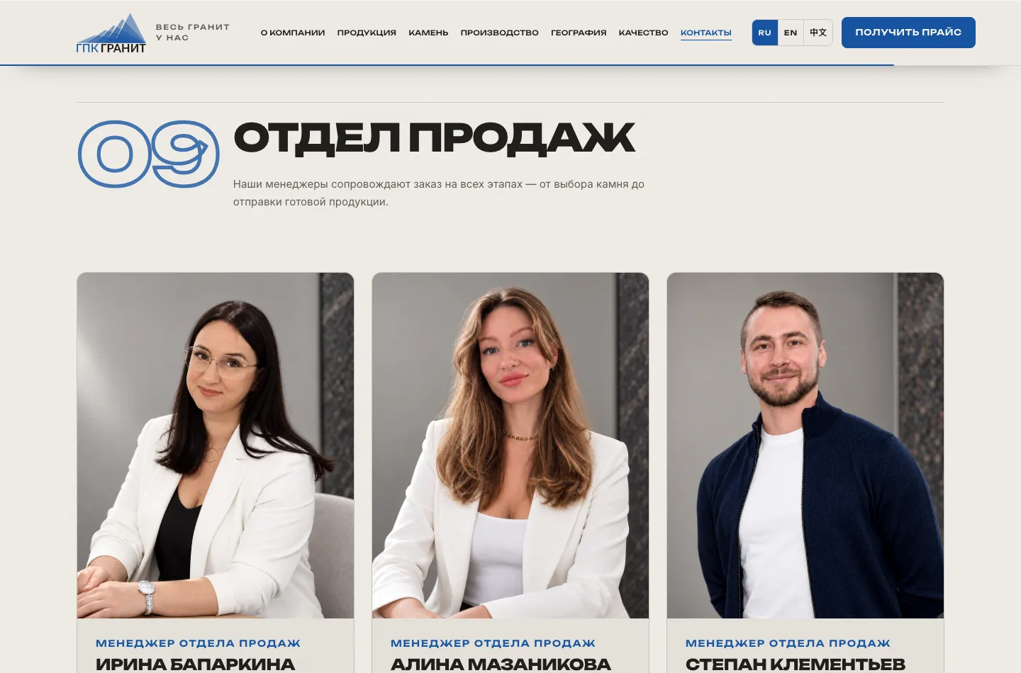
The “ask for price” buttons in the product cards don't open a pop-up: they scroll to the sales department, highlight a manager and put the subject into the form - fewer modal windows, a shorter path to the conversation.
Three languages: English and Chinese
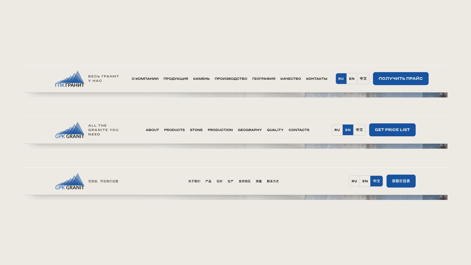
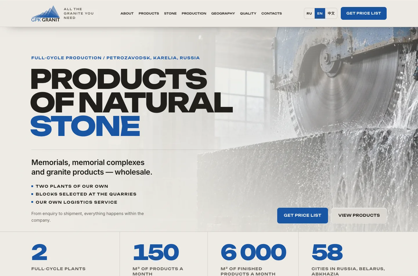
The company works for the international market, and in the autumn English and Chinese versions were added to the landing page. The whole site was translated, not just the first screen: the blocks of the home page, product cards, stone types, quality criteria, forms, legal pages and every interface label.
How it works:
- The addresses are “/en/” and “/zh/” in the same structure as the Russian version. Chinese is simplified (zh-Hans).
- One template, three languages. The texts of all versions live in files of identical structure, and 135 interface labels - buttons, form hints, error messages - were taken out of the layout and the scripts into dictionaries. An edit in one place spreads across three languages.
- The “RU · EN · 中文” switcher sits in the header and in the footer, with no flags: a flag is a country, not a language. On the phone the segments are enlarged to a comfortable tap target.
- The switcher keeps the section: from the English “Products” the visitor lands on the Chinese “Products”, not at the top of the page.
- There is no automatic redirect by browser language - the visitor chooses. For search engines there are hreflang tags with four values (ru, en, zh-Hans and x-default pointing at the Russian version), canonical links and a sitemap with alternates; service pages are closed in robots.
The Chinese version needed its own typography. The characters are rendered in system fonts - PingFang SC on Apple devices, Microsoft YaHei on Windows, Noto Sans SC elsewhere: the visitor doesn't download extra megabytes of a Chinese web font. The letter-spacing that keeps the rhythm in Russian and English headings was removed in the Chinese version - characters have no case, and tracking simply scatters them.
The logo was rebuilt in Latin script. The letters of the original mark are set in Lato, so “GPK GRANIT” came together at the same size and on the same baseline, and the width of the wordmark was matched to the width of the mountains in the mark - the English and Chinese versions got their own logo rather than Cyrillic letters next to Chinese characters.
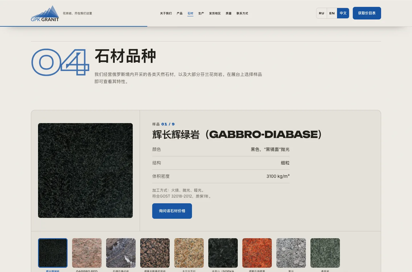
We translated in-house, with a glossary of terms and a separate list of debatable points for the client: стела - stele - 碑身, подставка - base - 底座, цветник - flower bed - 花池, столбики - posts - 立柱. Figures, dimensions, coordinates and phone numbers are not translated at all - they are shared across the three languages and edited once.
The names of the 58 cities on the supply map were translated separately: in Latin script on the English version and in characters on the Chinese one. The map, the routes and the “58 cities · 3 countries” counter stayed the same.
Separately we dealt with what differs not in words but in substance:
- Messengers. On the Russian version the managers offer a call, Telegram and MAX; on the English and Chinese versions MAX is hidden - it is of no use to a buyer abroad, so the phone, e-mail and Telegram remain.
- Delivery abroad is described honestly in the “Shipment” step: discussed individually. We were not going to promise international logistics that does not exist in the tariffs.
- Company details. The Russian tax and registration numbers are spelled out on the English and Chinese versions, so a foreigner can see what they are; the legal address is rewritten in the order they are used to, and on the Chinese version it is duplicated in Latin script.
- The legal pages are translated in full, with a note that the Russian version is the legally binding one. Points about e-mail and about the file a visitor attaches to an enquiry were added to the English and Chinese versions.
- The file picker in the form had to be made our own. The standard “No file chosen” label is drawn by the browser in the language of the operating system: for a Russian visitor the English form would have shown a Russian label in the middle of English copy.
- Enquiries from all three versions go to the same sales managers - with a note of the language the request came in.
No separate promotion abroad was launched - the technical groundwork is in place: hreflang, canonical, a sitemap with alternates. A useful side effect of earlier decisions: the fonts, styles and scripts sit on the site's own domain, there are no external CDNs or Google Fonts on the page - so the site opens the same way from any country, including China, where some external services are unavailable.
Mobile version
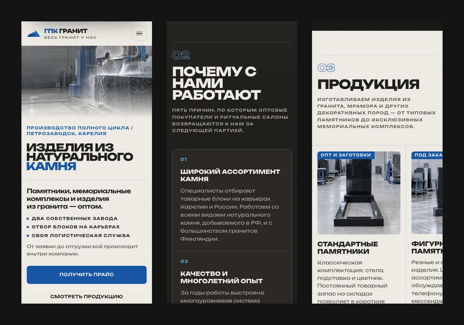
A wholesale buyer often opens the site on their phone right in the middle of a conversation with a manager, so the mobile version is not a squeezed desktop but a separate layout.
- Two actions are pinned to the bottom of the screen - “call” and “get the price list”.
- Large headings, the size table and the stone catalogue are rebuilt for the narrow screen and remain readable.
- Maps, forms and product cards work just as they do on desktop.
- The language switcher is built into the header at every width: we checked from 320 to 1440 pixels in all three languages, so the header never breaks and the page never scrolls sideways.
Outcome
The stone production company got a turnkey landing page in two working days, and then English and Chinese versions in one more: strict industrial design, content brought into order, interactive maps and catalogues, a separate mobile version and three languages in a single template.
The result: a one-page site that shows a wholesale customer the whole production at once - plants, products, stone types, quality criteria and supply geography. In Russian it works for the loyalty of existing clients; in English and Chinese it opens the company up to markets abroad. Still no paid traffic is sent to the page.
View the page: https://gpkgranit.ru/, the English version - https://gpkgranit.ru/en/, the Chinese one - https://gpkgranit.ru/zh/.


FAQ
FAQ.

Yes, we offer full-cycle social media promotion: strategy, content creation, targeted advertising and results analytics.
We give you access to trello/asana where you can see every stage of the work. We also hold regular calls and send progress reports.
Yes, we work with staged payments. You pay for each completed stage according to the approved plan.
Timing depends on the project's complexity. On average a website takes 2 to 6 weeks. We always give exact deadlines before the work starts.
We can work with your content or offer our copywriters to create unique texts and select images.
The price is made up of the scope of work, functionality complexity, design and additional services (content, crm integration, etc.). We provide a detailed estimate broken down by stages.
With an audit: we study the business, the audience and the goals and shape a clear strategy. Then we fix the terms in a contract, agree on the details and start. Results are shown in numbers, and we build the project's growth on them.
You can leave a request at any time - our operators will call you back within a day. The office works on weekdays from 10:00 to 19:00 moscow time.
Still have questions? We may already know the answer
we'll get back to you within one business day

we help businesses grow
Ready to grow?
Leave a request and our managers will get back to you within one business day


