
TOCHNYE RESHENIYA
CASE /52 · LAW FIRM, MOSCOW AND STAVROPOL
A website for “Tochnye Resheniya”.
“Tochnye Resheniya” is a law firm with offices in Moscow and Stavropol. It handles arbitration disputes, corporate bankruptcy, protection from subsidiary liability and corporate conflicts, and for private clients — family and property cases involving significant assets. They came to us without a website: IT had to be built from scratch and delivered turnkey.
A REAL CASE STUDY, FROM BRIEF TO RESULT: HOW WE WORK AND WHAT WE ACHIEVE
PROJECT TEAM
 EvgenyDEVELOPER
 ElenaFRONT-END DEVELOPER
 NataliaUX PROTOTYPER
 KirillQA ENGINEER
CLIENT
NICHE
CLIENT'S WEBSITE
WHAT WE DID
RESULT
Background
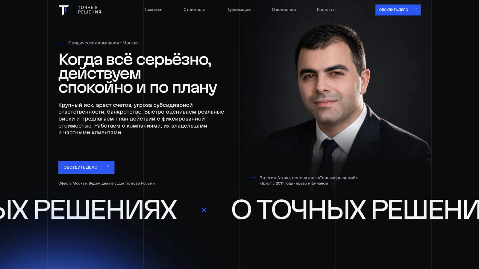
“Tochnye Resheniya” is a law firm with offices in Moscow and Stavropol. It handles arbitration disputes, corporate bankruptcy, protection from subsidiary liability and corporate conflicts, and for private clients — family and property cases involving significant assets. They came to us without a website: it had to be built from scratch and delivered turnkey.
What we had at the start:
- the company and its practice areas, a team of seven lawyers, two offices;
- no website, no structure, no copy, no mockups — everything had to be created on our side;
- a clearly defined audience: business owners and executives for whom things have already become serious — a major lawsuit, frozen accounts, bankruptcy.
The task was simple to state: a website that a person in a difficult situation would trust with their case. No promises of a “guaranteed result”, no hard sell — calm, precise and expensive in feel.
How we organised the work
The project was completed in three weeks, with one more week spent on revisions after delivery. The team: a project manager, an account manager, a designer, a front-end developer and a programmer.
Three weeks for a website with forty practice pages is not about speed for its own sake. It is about overlapping stages: while the designer was assembling the home page, the practice copy was being written and the programmer was preparing the theme and post types for the future content. The project manager kept the plan and deadlines on track, the account manager handled client communication and approvals, so that the designer, front-end developer and programmer were not distracted from their work.
What went into the three weeks:
- site structure and prototypes of the key pages;
- a design system and the design of every page type;
- copy for all sections, including forty practice pages;
- front-end, theme development and an admin panel for the content;
- content population, maps, forms, seo setup and testing on devices.
There were no difficulties on the project: the work ran smoothly, the client trusted the team's decisions, and the team hit the expectations on the first attempt. That is a rare thing and it is worth a great deal — the revisions after delivery added up to exactly one week.
Structure: two practice branches and forty pages
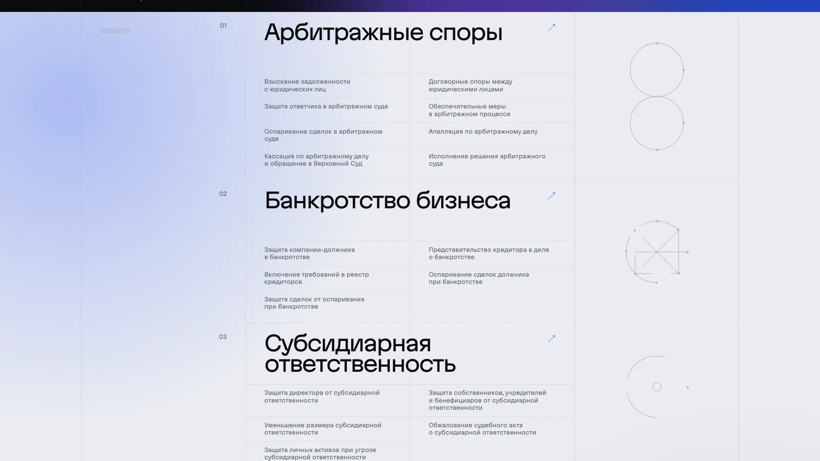
The main structural decision was to split the practice areas into two branches: “for business” and “for private clients”. A person looking for protection from subsidiary liability and a person dividing a business in a divorce should not have to fight their way through one shared menu.
What went into the structure:
- the home page, “about the firm”, “pricing”, “publications”, “contacts”;
- the practice areas section: four areas for business (arbitration disputes, corporate bankruptcy, subsidiary liability, corporate conflicts) and two for private clients (family and property disputes, bankruptcy involving complex assets);
- within each area — separate pages for specific tasks: protecting the director, contesting the debtor's transactions, inclusion in the register of creditors, dividing a business in a divorce, and so on. Forty practice pages in total;
- seven lawyer pages with education, experience and specialisation;
- publications marked up by type (article, practical analysis) and by tags.
Every practice page follows the same scheme: when a lawyer needs to be brought in, how we handle the case, pricing, which documents are needed for the initial analysis, the firm's experience, frequently asked questions, a detailed analysis of the topic and related services. Each page has a table of contents — the materials are long, and the reader needs navigation.
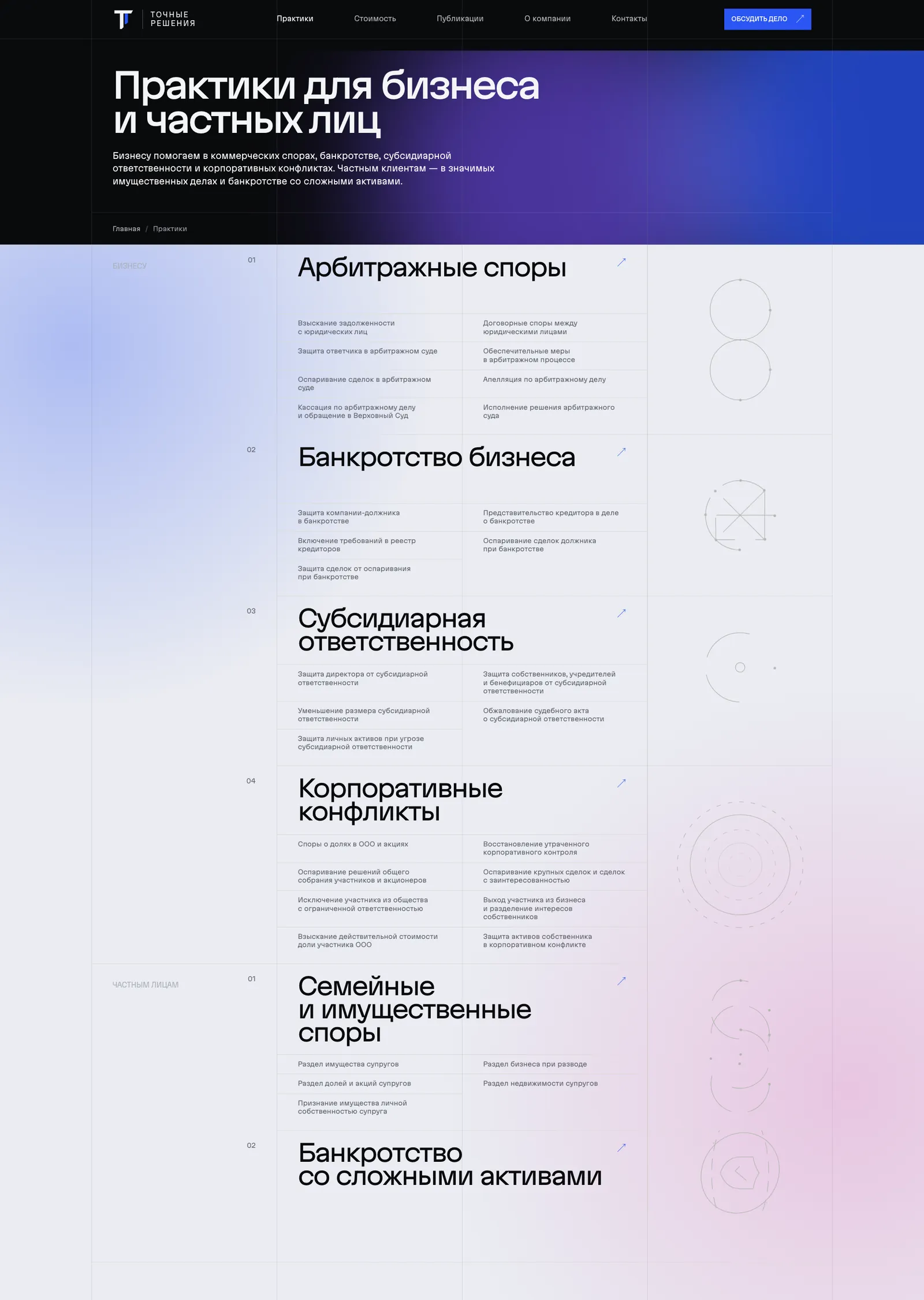
This structure was built with the next stage in mind — seo. Every query such as “protecting a director from subsidiary liability” has its own landing page, rather than a general section with a paragraph on the topic.
Design: a dark interface and large typography
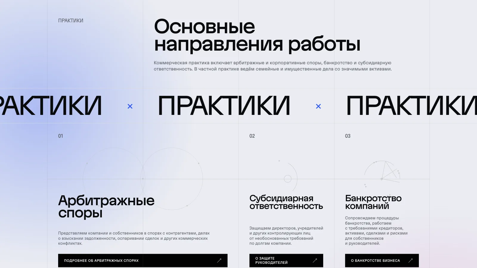
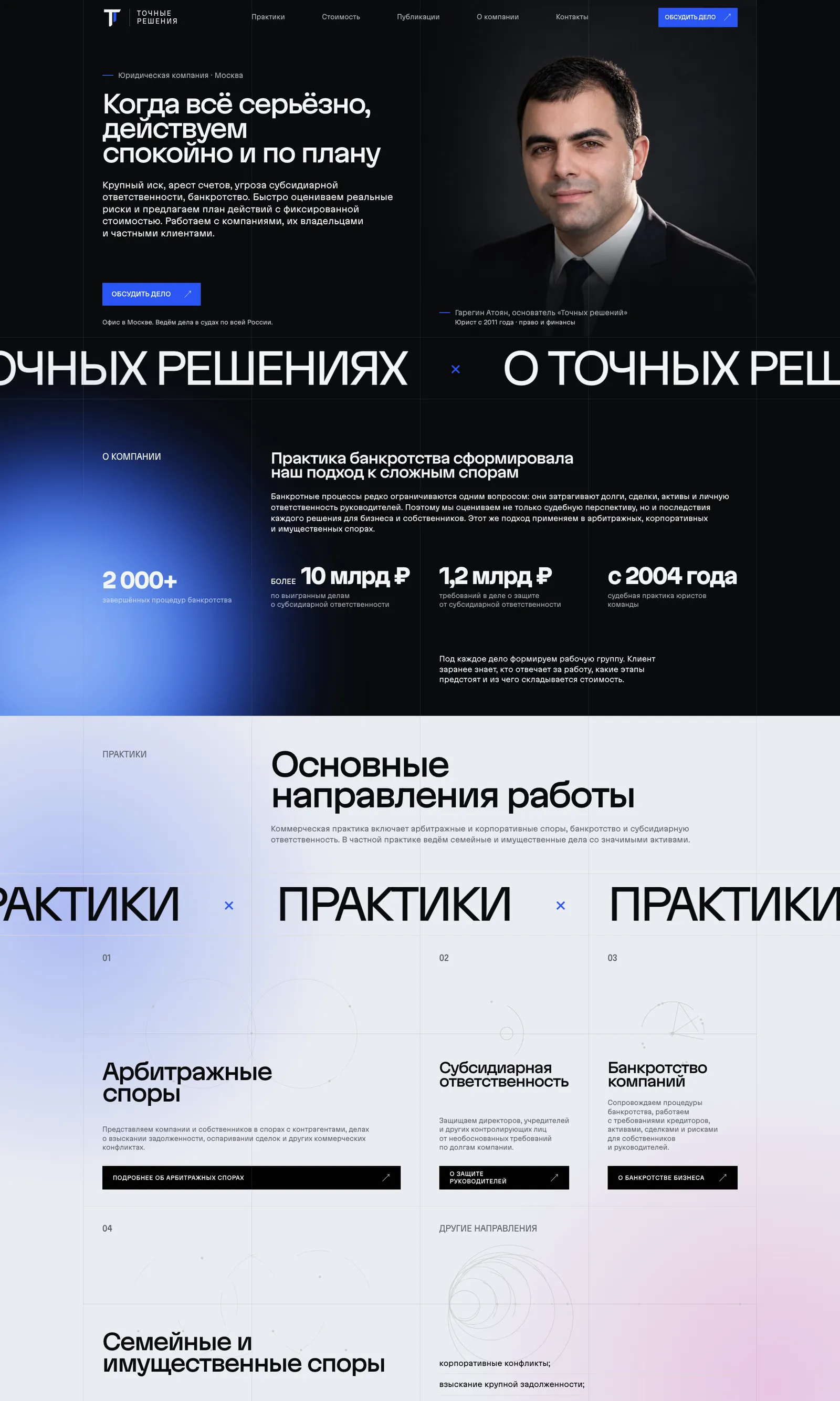
A law firm website usually looks like a business card from the nineties: blue, white, scales and columns. We did the opposite — an ink-dark interface, large headings, a clean grid and minimal decoration.
What the visual language is built from:
- Two background tones: an inky near-black and a light “paper”. The sections alternate, and the page breathes: a dark hero, a dark block about the firm, a light practice areas block, then a dark approach-to-work block again.
- One accent colour — electric blue. It appears on buttons, bullets and thin lines, and nowhere else.
- One typeface for everything: a grotesque with variable width, slightly extended in the display headings. The headings on the first screen are set very large, in three lines.
- Marquee lines between sections — “about tochnye resheniya”, “practice areas”, “how we work”. They divide the page into chapters and set the rhythm.
- Soft coloured glows on the dark background instead of photographic backdrops: blue by the block about the firm, lilac and pink on the light sections.
- The practice area icons are drawn in thin lines as geometric diagrams, not as stock pictograms with scales.
The lawyers' portraits were shot against a dark background and embedded in the interface so that the founder's photo on the first screen continues the black background of the hero. The large figures in the block about the firm — “2,000+ completed bankruptcy proceedings”, “over ₽10 billion in cases won” — are set in display size and work as evidence, not as decorative infographics.
Copy: no promises and fixed prices
The copy was written on our side, and the main challenge was not volume but tone. The site speaks to a person who has a problem, so there is no “best lawyers in Moscow” and no “100% of cases won”.
The principles behind the copy:
- honest about prospects: “we do not promise a guaranteed result and we do not hide risks in order to sign a contract”;
- in plain language: every practice page explains exactly when a lawyer is needed and what will happen next;
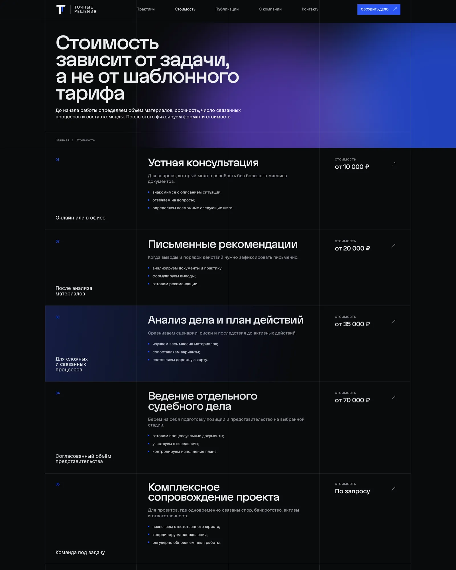
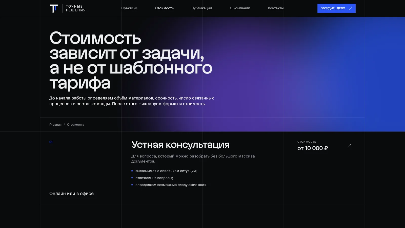
- pricing is open: four working formats — an oral consultation, a document review, a written opinion and a strategic diagnosis — each with its price, timeframe and scope of documents;
- the process is shown step by step: assessment, documents and risks, legal position, active steps, project control, completion.
The lawyer pages were worked through separately: position, years of experience, registration number in the register of insolvency practitioners, specialisation, education by year, work experience. In the legal field this is both trust for the reader and a signal of expertise for the search engines.
Development: WordPress and a custom theme
The site is built on WordPress with a theme written from scratch for this design. No ready-made templates or page builders — none of them would have delivered this typography and this grid.
What was done in development:
- separate post types for practice areas, publications and lawyers, so that the client can add pages through the familiar admin panel rather than through code;
- publication taxonomies: material types and tags, each with its own page and place in the sitemap;
- the variable font is hosted locally with preloading — no external font services and no unnecessary requests;
- smooth scrolling and section reveal animations on a custom script; for those who have disabled animation in their system settings, all motion switches off automatically;
- a team carousel on the home page and on the about page;
- Yandex Maps with switching between the two offices — Moscow and Stavropol;
- enquiry forms on every page and in a pop-up window: required fields, consent to data processing under Federal Law 152-FZ, a confirmation screen;
- seo setup: page titles, canonical URLs, open graph, a sitemap by content type, robots, a set of favicons and a web manifest.
A separate block of work was the legal side of the site itself: a personal data processing policy and a separate consent page, linked from every form. For a law firm, a mistake here would cost its reputation.
Mobile version
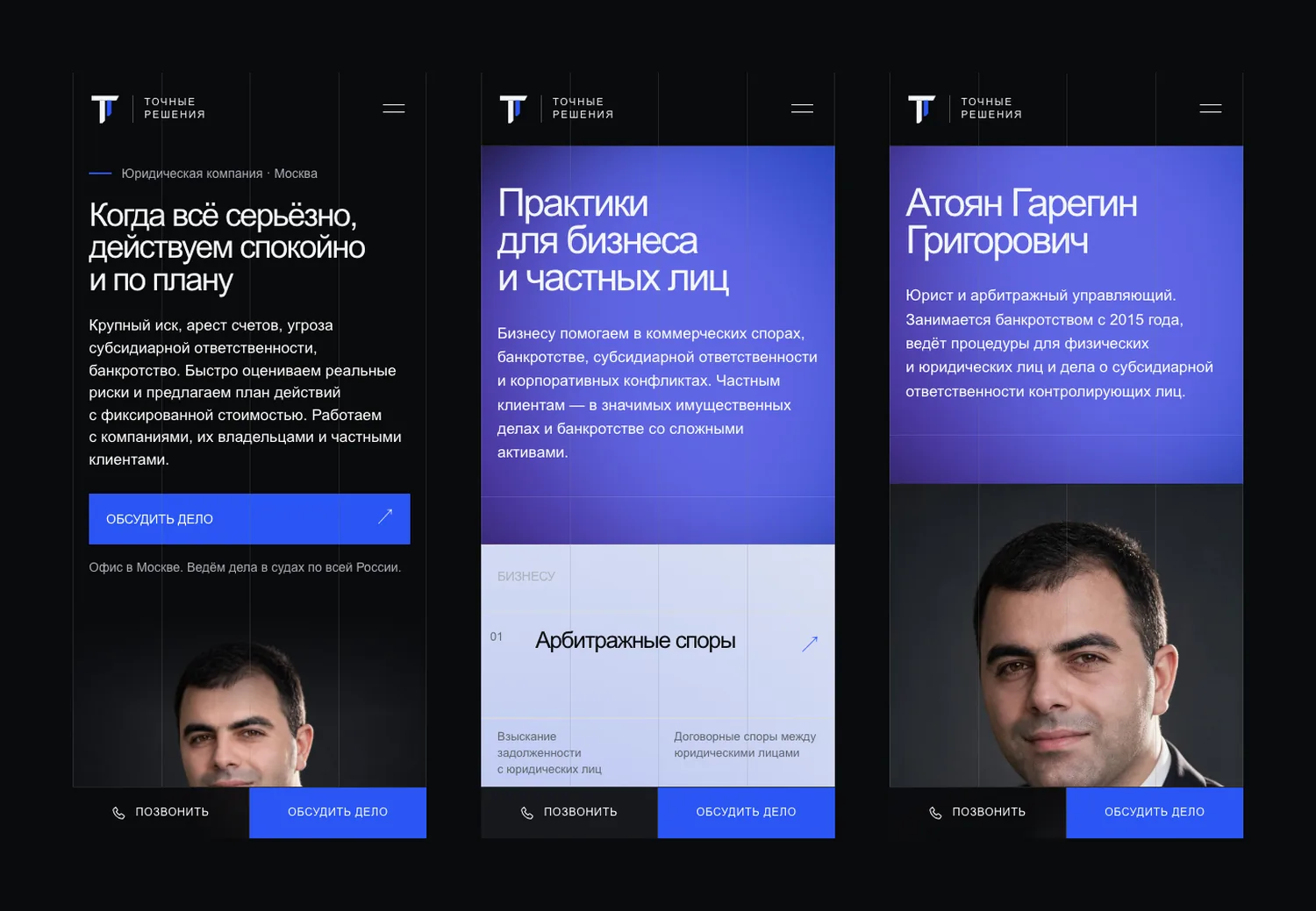
A significant share of people in a difficult situation will open the site on their phone, so the mobile version is not a squeezed desktop but a layout of its own.
- Three breakpoints: phone, tablet, desktop; on wide screens the grid is capped so that lines do not stretch.
- A panel with two actions — “call” and “discuss your case” — is pinned to the bottom of the screen. The person does not need to look for contact details; they are always under the thumb.
- The large first-screen headings were rebuilt for the narrow format: three lines stayed three lines instead of turning into six.
- On the phone, the practice area lists turn into vertical blocks with the same numbering as on the desktop.
Revisions and launch
After delivery in three weeks, the client went through the site and gave their comments. Working through them took one week — and that is for a site that was already populated with forty practice pages.
Then came the launch on the live domain. Our signature sits in the site's footer: we stand behind this project publicly.
Outcome and what comes next
The law firm received a turnkey website: structure, design, copy, front-end and development — in three weeks plus a week of revisions. No concept rework: the team hit the client's expectations on the first attempt.
The result: a site of more than sixty pages — the home page, six practice areas and forty practice pages, seven lawyer pages, pricing with four formats, publications, contacts with two offices — built from scratch and delivered in 3 weeks; a week for revisions; a custom WordPress theme with an admin panel for practice areas, publications and the team.
The next stage, which we are planning together with the client, is seo promotion of the practice landing pages and paid traffic. The site structure was built with exactly this in mind — every query already has its own page.
See the website: tochnye-resheniya.ru.


FAQ
FAQ.
Yes, we offer full-cycle social media promotion: strategy, content creation, targeted advertising and results analytics.
We give you access to trello/asana where you can see every stage of the work. We also hold regular calls and send progress reports.
Yes, we work with staged payments. You pay for each completed stage according to the approved plan.
Timing depends on the project's complexity. On average a website takes 2 to 6 weeks. We always give exact deadlines before the work starts.
We can work with your content or offer our copywriters to create unique texts and select images.
The price is made up of the scope of work, functionality complexity, design and additional services (content, CRM integration, etc.). We provide a detailed estimate broken down by stages.
With an audit: we study the business, the audience and the goals and shape a clear strategy. Then we fix the terms in a contract, agree on the details and start. Results are shown in numbers, and we build the project's growth on them.
You can leave a request at any time — our operators will call you back within a day. The office works on weekdays from 10:00 to 19:00 moscow time.
Still have questions? We may already know the answer
WE'LL GET BACK TO YOU WITHIN ONE BUSINESS DAY

GOT A TASK?
Ready to grow?
Leave a request and our managers will get back to you within one business day