

≈ 7 min read
article · 14 November 2026 · ux / design
A consistent social media feed: palette, fonts and templates without the boredom.
How to build a consistent visual style for your social media feed: choose a palette and fonts, prepare templates and covers, and keep enough variety so followers do not get bored.
written by

Valeria
web designer · 6 years
People decide whether to follow a company page within seconds: they open the profile, see the grid of recent posts and form an impression before reading a single one. A motley feed where every image is made in its own manner looks like a store room of random materials, while a coherent one looks like the shop window of a brand you can trust.

People decide whether to follow a company page within seconds: they open the profile, see the grid of recent posts and form an impression before reading a single one. A motley feed where every image is made in its own manner looks like a store room of random materials, while a coherent one looks like the shop window of a brand you can trust.
We look at how to build a consistent visual style for a feed: which decisions to make once, how to turn them into templates and how to stay recognisable without turning the page into an endless row of identical cards.
Why a business needs a consistent feed style
The main benefit is standing out among other posts. Company posts appear mixed with posts from friends, news channels and competitors, and you have a split second for a person to understand who the message is from. When colours, fonts and composition repeat, the post is recognised before the caption is read, so people stop on it more often.
The second reason is saving time. Without rules, every layout has to be invented from scratch, with debates about the headline colour and redone covers. In our experience, companies in Moscow that once invested time in a design system then publish posts noticeably faster. Finally, a coherent image builds trust: a neat page suggests the company pays attention to detail in everything else too. That is why the visual side is not decoration but a full-fledged tool that social media promotion relies on.
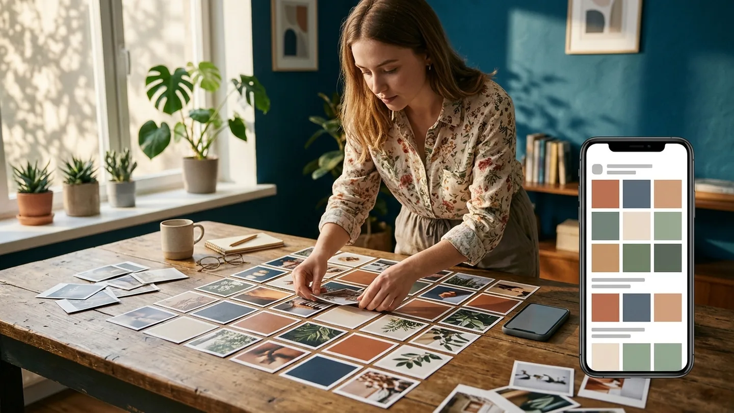
Brand identity as the foundation of the feed
A feed style starts not with beautiful pictures but with a small set of decisions that are then followed in every post. If the company already has a brand book with a logo, colours and fonts, build on it: the social media page should look like a continuation of the website and the shop sign, not a separate project.
If there is no brand identity, it is worth developing at least a minimal one. Trying to invent the design while posting usually ends with a feed made up of three or four different eras within six months. A logo and basic rules can be ordered separately, for example as part of a design and branding service, and then adapted to each platform’s formats.
Palette and fonts
Three to five colours are enough for a feed, and each has its own role. Below is a set of rules usually recorded in a short style guide:
- a main brand colour for accents and labels;
- one or two additional shades for backgrounds and separating content series;
- neutral colours for text and underlays;
- one or two fonts: an expressive one for headings and a simple one for small text;
- a common colour temperature for all images.
Colours are chosen with an eye to how they look on a small screen and next to the platform’s interface. Very light shades get lost on VK’s white background, and a thin elegant font turns into an unreadable line in a scaled-down preview. How shades affect perception and user decisions is covered in our article on colour psychology.
Templates: how to speed up content creation
Approved colours and fonts are packed into a set of templates: a quote card, a tip post, an event announcement, a client review, a product selection. Each layout has a fixed place for the headline, logo and image, so a new post is assembled in minutes and the feed looks coherent even if different people prepared it. Even an employee without design experience can publish such posts.
Covers deserve special attention: those of short videos, albums, pinned stories and menu sections. They shape the look of the page when someone visits it for the first time. A technique that works well is keeping the same cover structure while giving each topic its own colour accent. This is especially important for promotion on VK: we covered how to design a community’s header, menu and sections in our article on designing a VK community.
How to avoid monotony
The flip side of strict rules is boredom. If every post is a white square with a headline of the same size, followers stop telling posts apart and scroll past without reading. A consistent style sets the boundaries, but variety is needed within them: different types of images, a rhythm of close-ups and wide shots, alternating photos and graphics.
A good rule is to keep two or three elements constant and vary the rest. For example, the font, logo and brand colour stay the same, while the background, composition and image type adapt to the purpose of each post. This way the page stays coherent and alive.
Rotating content series and formats
Variety is easiest to build in at the planning stage. When topics are distributed across weeks in advance, you can see where three identical cards follow one another and fix it before publication. If each content series has its own layout, alternating topics creates a visual rhythm by itself. We explain how to draw up such a monthly plan in our article on a social media content plan.
Each platform has its own logic. On Telegram the feed is read from top to bottom, and the role of the grid is taken over by consistent post covers and recognisable link formatting, so running a Telegram channel requires its own set of templates. We described how to develop a company channel in our article on a Telegram channel for business.
Signs that the feed has gone stale
Audience fatigue usually shows in the statistics before it shows in feedback: post reach falls while the number of followers stays the same, there are fewer saves and shares, and comments shrink to single reactions. If the posts also look almost identical, the cause often lies in the design rather than the topics.
There is no need to change the whole style in this situation - an abrupt change undermines recognition. It is enough to update one or two templates, add a new format such as a step-by-step carousel or a short video, or introduce a seasonal accent into the palette. After a month or two, compare the metrics with the previous ones and keep what worked.
Running social media by shared rules: how to implement the style
A design system only works when everyone who publishes follows it: the SMM specialist, the manager, an external designer. To avoid arguments, it helps to write down explicitly what is fixed in the style and where freedom is allowed:
| Element | What is fixed | What can change |
|---|---|---|
| Palette | Main colour and neutral shades | Seasonal accent, series colour |
| Fonts | Typefaces for headings and text | Size and weight for the format |
| Logo | Position and minimum size | Light or dark version for the background |
| Series templates | Grid and block layout | Background, image, composition |
| Covers | Overall structure | Topic colour accent |
The implementation itself is best done step by step:
- Collect current posts and note what is already recognisable in them.
- Approve the palette, fonts and image processing rules.
- Prepare templates for each content series and platform format.
- Describe the requirements in a short guide with “do” and “don’t” examples.
- Review the layouts against statistics once a quarter.
A well-designed feed does not replace useful content, but it noticeably increases the chances that it will be seen and read. If you want your page, posts and advertising to work as a whole, contact our social media promotion specialists: our SMM work starts with a review of your current feed, after which we propose a system that is easy to maintain.
articles
More equally interesting articles.

marketing
Retargeting: bringing visitors back
Which departed visitors are worth following up with ads, how to set up retargeting in Yandex Direct and VK Ads, and how to tell whether it brings sales rather than just cheap leads.
read the article14 November 2026tools
Image optimization for SEO
How to prepare images for a website: which format and file size to choose, how to set up sizes and lazy loading, how to write alt text and file names, and how to get into image search.
read the article13 November 2026marketing
Sales copy for a website
What to find out before you write, how to structure the page, how to replace clichés with facts and back promises with proof - and how to check the copy before publishing.
read the article13 November 2026FAQ
FAQ.

Yes, we offer full-cycle social media promotion: strategy, content creation, targeted advertising and results analytics.
We give you access to trello/asana where you can see every stage of the work. We also hold regular calls and send progress reports.
Yes, we work with staged payments. You pay for each completed stage according to the approved plan.
Timing depends on the project's complexity. On average a website takes 2 to 6 weeks. We always give exact deadlines before the work starts.
We can work with your content or offer our copywriters to create unique texts and select images.
The price is made up of the scope of work, functionality complexity, design and additional services (content, crm integration, etc.). We provide a detailed estimate broken down by stages.
With an audit: we study the business, the audience and the goals and shape a clear strategy. Then we fix the terms in a contract, agree on the details and start. Results are shown in numbers, and we build the project's growth on them.
You can leave a request at any time - our operators will call you back within a day. The office works on weekdays from 10:00 to 19:00 moscow time.
Still have questions? We may already know the answer
we'll get back to you within one business day

we help businesses grow
Ready to grow?
Leave a request and our managers will get back to you within one business day


